Broadcast messaging for scaling clinics
Structured, compliant patient communication that took a hidden operational load off doctors as clinics scaled.
Executive Summary
Scaling clinics struggled to communicate with patients consistently. Doctors and clinic staff manually created and sent reminders, follow-ups, and health updates one patient at a time. The process was time-consuming, difficult to standardize, and introduced compliance risks as patient volumes increased. What began as a communication task became an operational bottleneck that reduced clinical efficiency.
Reframe messaging as a governed workflow instead of an individual task. Through user research, workflow analysis, and stakeholder collaboration, I designed a Broadcast Messaging platform that standardized communication using approved templates, audience segmentation, automated scheduling, and built-in compliance validation. The experience reduced manual effort while ensuring every message followed organizational policies.
The solution transformed patient communication into a scalable operational capability.
- ~11 hours saved per doctor every week
- 3× increase in messaging capacity without additional staff
- Zero compliance violations after rollout
- Improved operational efficiency across clinics
- More consistent and timely patient communication
- Doctors spent more time on patient care instead of administrative work
Patient Communication Didn't Scale
As clinics grew, patient communication became fragmented across doctors, nurses, front desk staff, and administrators. Without a centralized system, every message depended on individual workflows, creating inconsistent communication, compliance risks, and increasing operational overhead.
- Calls & SMS
- Treatment follow-ups
- Appointment confirmations
- Rescheduling
- WhatsApp updates
- Care reminders
- Billing
- General notifications
- Manual Communication — Messages were created and sent individually, leading to duplicated effort and inconsistent patient experiences.
- No Governance — Compliance relied on staff remembering policies instead of the system enforcing them.
- Limited Visibility — Communication was scattered across channels with no unified history or reporting.
- Poor Scalability — More patients meant more manual work, making growth inefficient and difficult to manage.
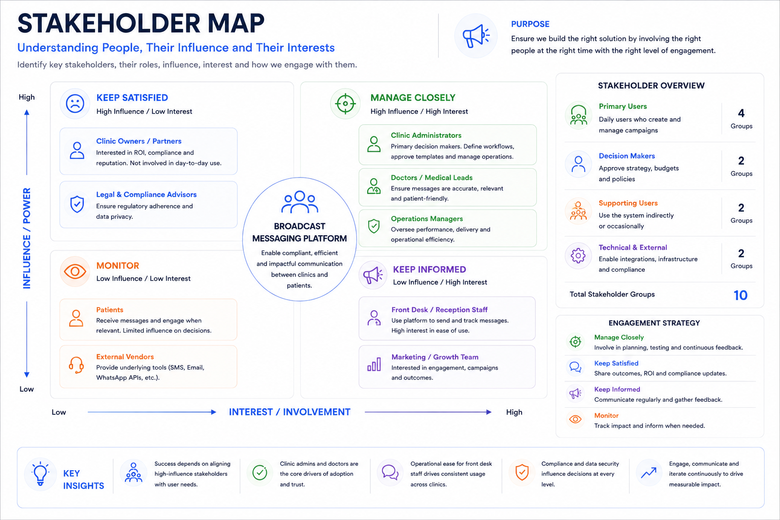
Stakeholder Map
Before designing anything, I mapped who touched patient communication and where their incentives diverged. Five groups had a stake in how messaging worked, each with a different priority and a different tolerance for risk.
- Clinic Administrators — Owned the rollout decision and needed proof the platform reduced operational overhead rather than just moving it around.
- Doctors — Wanted communication off their plate entirely, but were wary of losing the personal tone patients associated with their care.
- Nurses & Front Desk — Handled the highest daily message volume and needed a workflow that fit between patient visits, not a new system to learn on top of everything else.
- Legal & Compliance — Held veto power over any template or send timing that hadn't cleared HIPAA-aligned review.
- IT/Engineering — Needed the system to integrate with existing scheduling data without adding a large ongoing maintenance burden.
I interviewed each group separately before bringing them together, since doctors and compliance had historically disagreed on what counted as "necessary" communication. Surfacing that conflict early meant it could be resolved inside the template approval workflow, rather than in a room after launch.
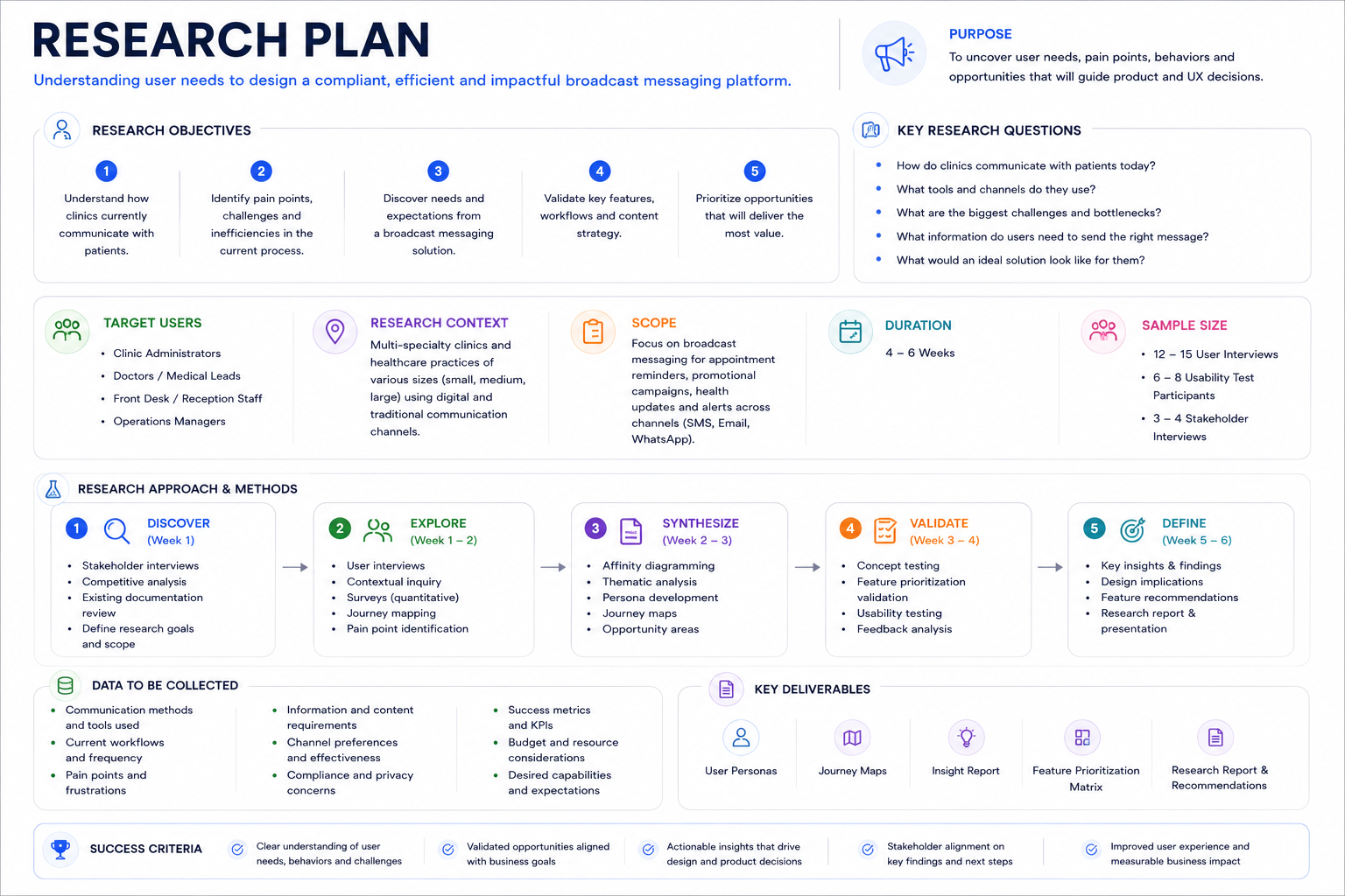
Research Plan
Research needed to answer two different questions: how staff actually communicated with patients today, and where compliance broke down in that process. I ran a mixed-methods study over three weeks across two pilot clinic locations.
- Contextual inquiry — Shadowed front-desk and nursing staff for a half-day each, observing how reminders and follow-ups were actually sent, not how policy said they should be.
- Semi-structured interviews — 9 sessions across doctors, nurses, admin staff, and one compliance officer, focused on where communication broke down and what workarounds staff had built.
- Artifact audit — Collected sample messages and message-thread exports (with consent) to identify patterns in tone, timing, and content a template library would need to cover.
- Compliance review — Worked with legal to map which message types required an audit trail under HIPAA-aligned recordkeeping requirements.
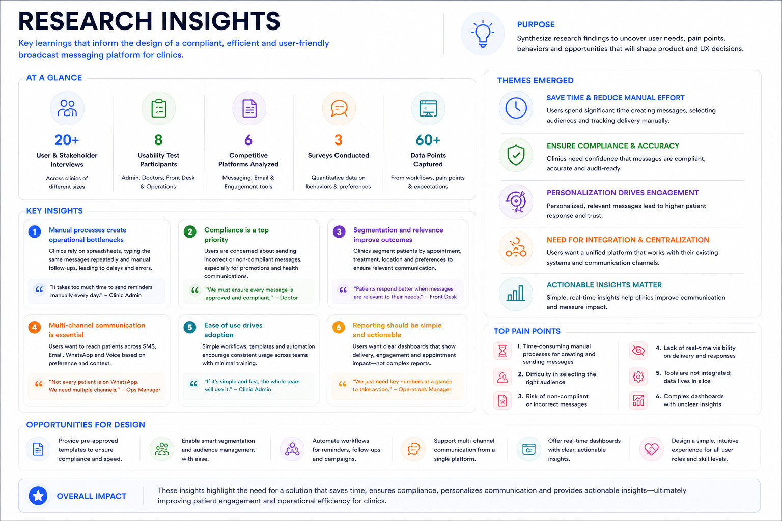
Research Insights
Three findings reshaped the direction of the design.
- Staff already had workarounds. Nurses kept a personal doc of message templates they reused and re-copied — proof that standardization was already the instinct, it just had no shared system to live in.
- Compliance risk lived in timing, not just content. Legal was less concerned with what was said and more with when and to whom — messages sent outside consented hours were the most common violation risk.
- Doctors wanted to approve, not write. In interviews, doctors said they'd trust a well-reviewed template more than something written from scratch under time pressure. One put it directly: "I don't need to write the message. I need to know it's already been checked."
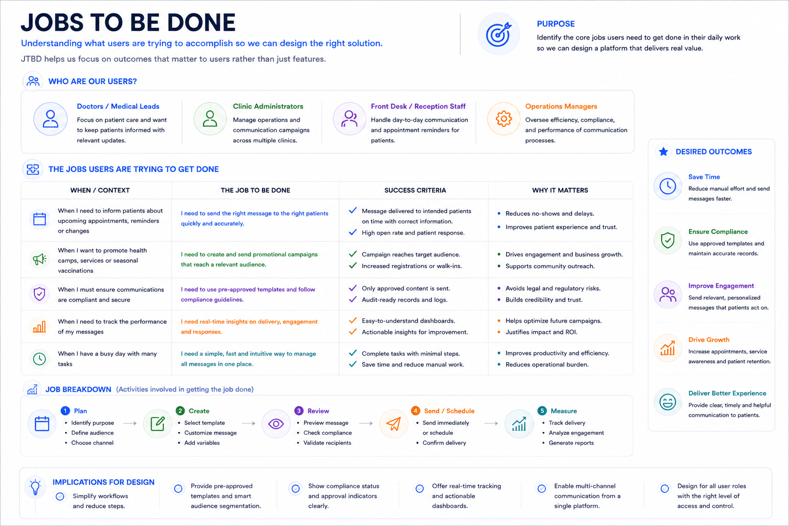
Jobs to Be Done
Framing each group's need as a job clarified what the product actually had to do, independent of any specific feature.
- Doctors — "When patient volume increases, I want to send timely updates without extra clinical time, so I can stay focused on care instead of admin work."
- Clinic Operations — "When we scale to more patients, I want communication to scale with fixed staff, so I can grow without proportional headcount cost."
- Patients — "When I have an upcoming appointment or care instruction, I want clear and timely information, so I can trust the clinic to keep me informed."
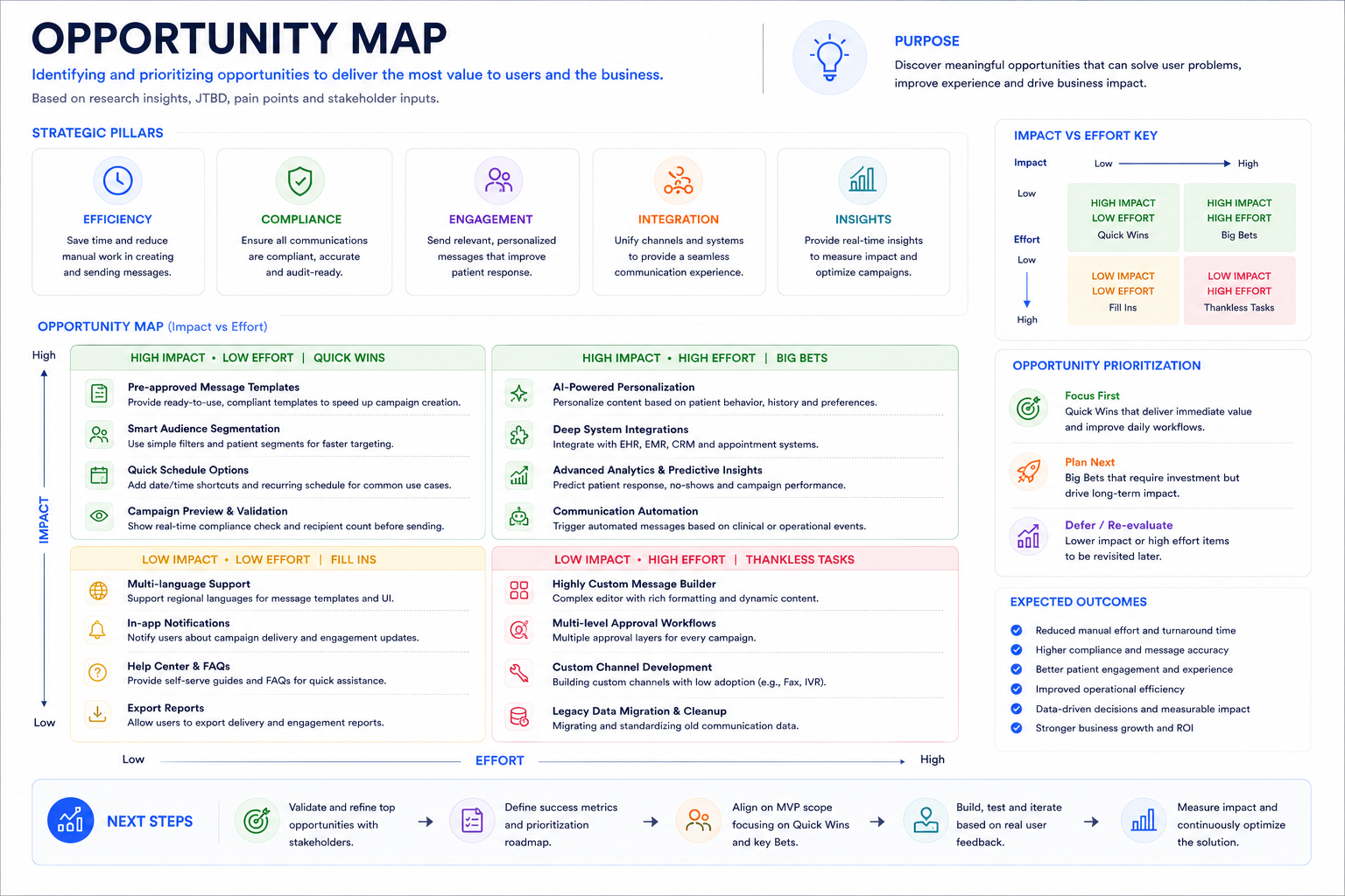
Opportunity Map
I plotted every opportunity surfaced in research against effort to build and impact on compliance risk, since the team had a three-month window to ship a first version. The clearest opportunity was eliminating manual, one-off messaging by encoding compliance directly into the design rather than relying on staff to remember policy.
Two-way messaging and AI-personalized content scored high on impact but also high on effort and legal review time, so I deprioritized both into a v2 roadmap in favor of shipping a smaller, safer core loop first: approved templates, segmentation, scheduling, and compliance validation.
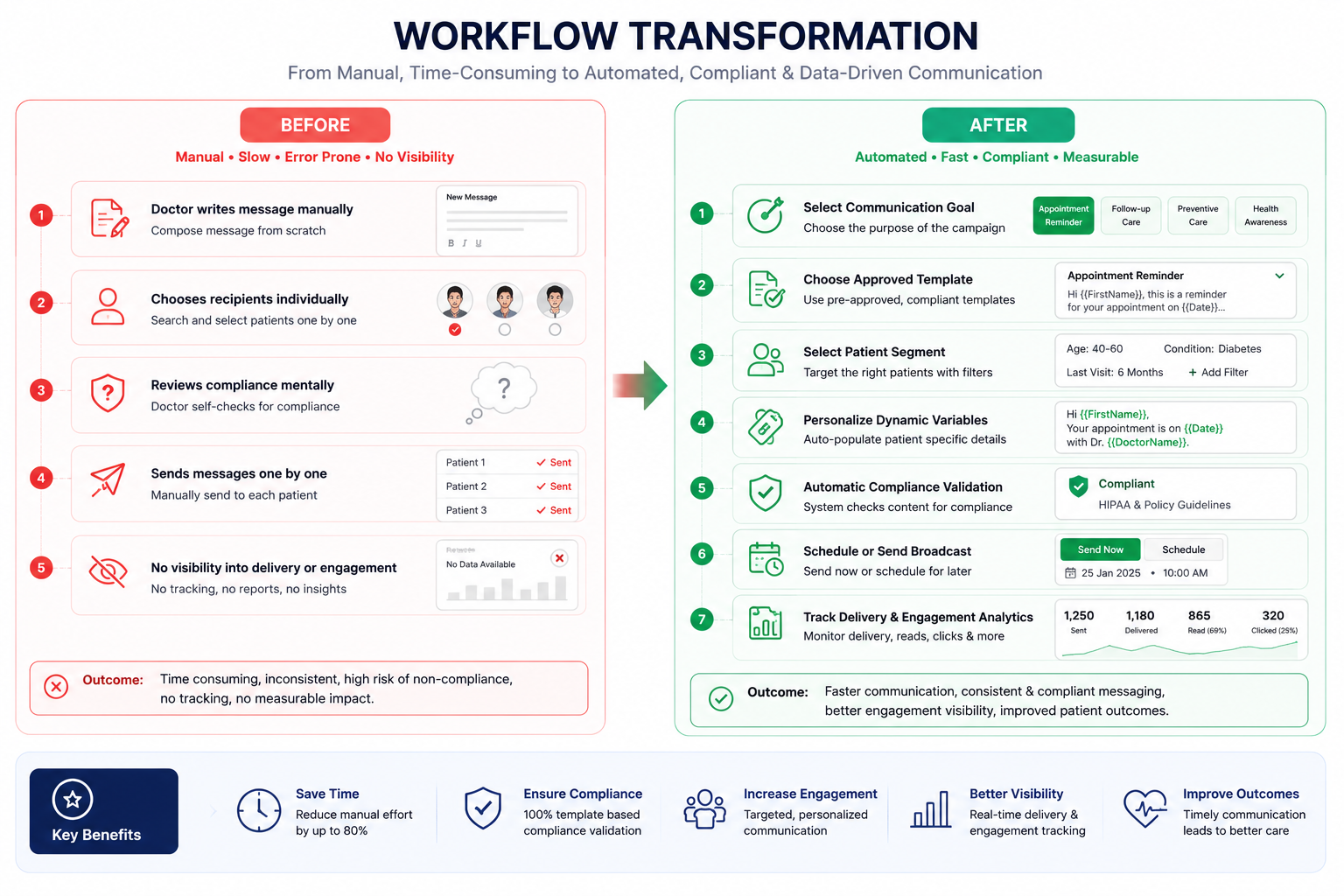
Designing a Communication System That Scales
Instead of optimizing how doctors sent messages, I redesigned the entire communication workflow. The goal was to transform patient messaging from a manual clinical task into a standardized, compliant, and scalable operational system.
Patient communication relied on individual doctors and clinic staff creating messages manually. As clinics grew, this process became inconsistent, time-consuming, and difficult to govern. Every additional patient increased operational workload and compliance risk.
The design strategy focused on making the safest workflow the easiest workflow. Rather than expecting users to remember communication policies, compliance rules were embedded directly into the product through guided workflows, approved templates, automated scheduling, and built-in validation.
- Standardize Communication — Replace free-form messaging with clinically approved templates to ensure consistency, reduce errors, and maintain regulatory compliance.
- Reduce Cognitive Load — Guide users through a structured workflow so they can focus on patient care instead of remembering policies, formatting, or communication rules.
- Automate Repetitive Work — Automate scheduling, audience selection, and campaign execution to eliminate repetitive administrative tasks and improve operational efficiency.
- Compliance by Design — Integrate approval rules, consent validation, and audit logging directly into the workflow so compliance becomes the default behavior instead of a manual responsibility.
- Design for Scale — Create a reusable communication framework that supports thousands of patient interactions without increasing operational effort or administrative overhead.
- Approved Template Library — Standardized all recurring patient communications using legally reviewed templates, reducing writing effort while ensuring consistency and compliance.
- Intelligent Scheduling — Allowed users to schedule campaigns in advance, reducing manual coordination and ensuring patients received messages at the appropriate time.
- Built-in Compliance Validation — Validated communication before sending, preventing policy violations instead of detecting them afterward.
- Audience Segmentation — Enabled users to target relevant patient groups based on appointments, treatments, and communication preferences rather than manually selecting recipients.
- Operational Visibility — Provided delivery status, engagement metrics, and audit logs to help clinics monitor communication effectiveness and maintain regulatory accountability.
By embedding compliance into the workflow rather than relying on user memory, the platform transformed patient communication into a repeatable operational process. Clinics could communicate faster, more consistently, and with significantly less administrative effort while maintaining clinical governance and regulatory compliance.
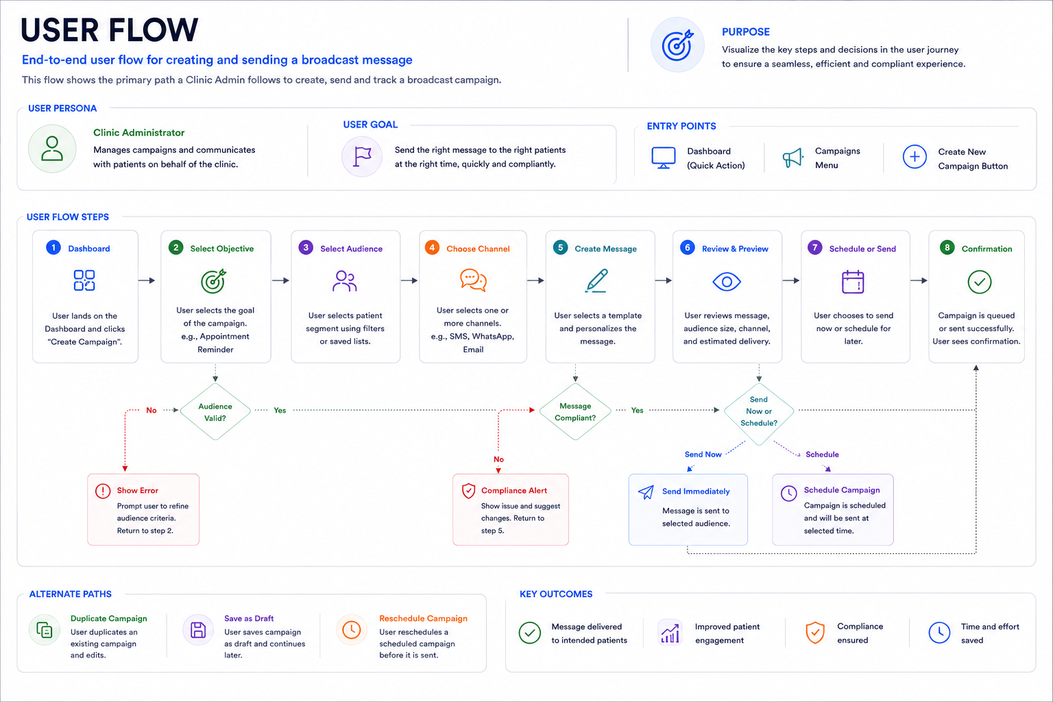
User Flow
The flow had to work for the common case — a routine appointment reminder — and the harder case, a personalized follow-up that still had to pass compliance.
- Select template
- Confirm audience segment
- Review send time
- Send or schedule
- Select template
- Edit dynamic fields, validated against an approved variable list
- System flags any free-text additions for compliance review
- Doctor confirms or removes flagged content, then sends
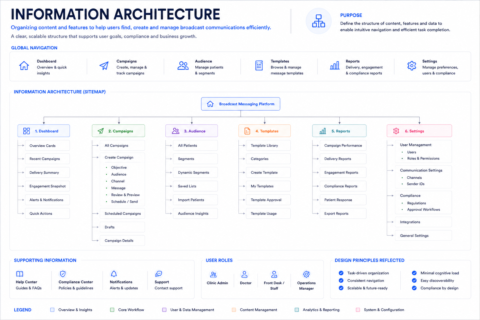
Information Architecture
The system organized around four areas: a Template Library, a Scheduling Interface, an Analytics Dashboard, and a Compliance Log.
The open question was whether the Compliance Log belonged inside Analytics or stood on its own. Legal accessed it far more often than they viewed engagement analytics, and nesting it would have buried the one view regulators cared most about — so I gave it equal billing in the primary navigation, even though it served a smaller audience than the Template Library.
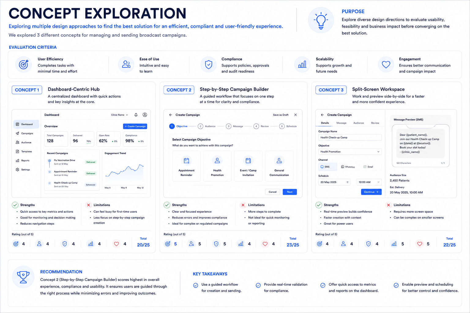
Concept Exploration
I evaluated three approaches before committing to a direction, ranging from fully manual to fully automated.
- Fully manual templates — Doctors pick from a static library with no automation. Simplest to build and audit, but didn't meaningfully reduce effort — someone still had to trigger every send.
- Fully automated triggers — The system auto-sends based on appointment data with no human review. Maximum time savings, but legal rejected it outright: removing a human checkpoint before every compliance-sensitive send was a non-starter under HIPAA-aligned audit requirements.
- Structured templates with manual scheduling (chosen) — Kept a human in the loop for every send while removing the effort of writing and formatting. This was the only option that satisfied both operational efficiency and compliance's need for a reviewable checkpoint.
I validated this tradeoff with legal and clinic operations separately before committing, since a design that satisfied one and not the other wouldn't have shipped.
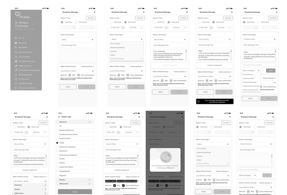
Wireframes
Low-fidelity layouts covered template selection, a customization form, a scheduling picker, a preview state, and a confirmation screen with a compliance checklist.
The first version of the customization form let doctors edit any field freely. After the first round of testing, I locked every field except one free-text note behind approved variables — that free-text field was where compliance risk was concentrated, and constraining it removed the majority of review flags in later testing.
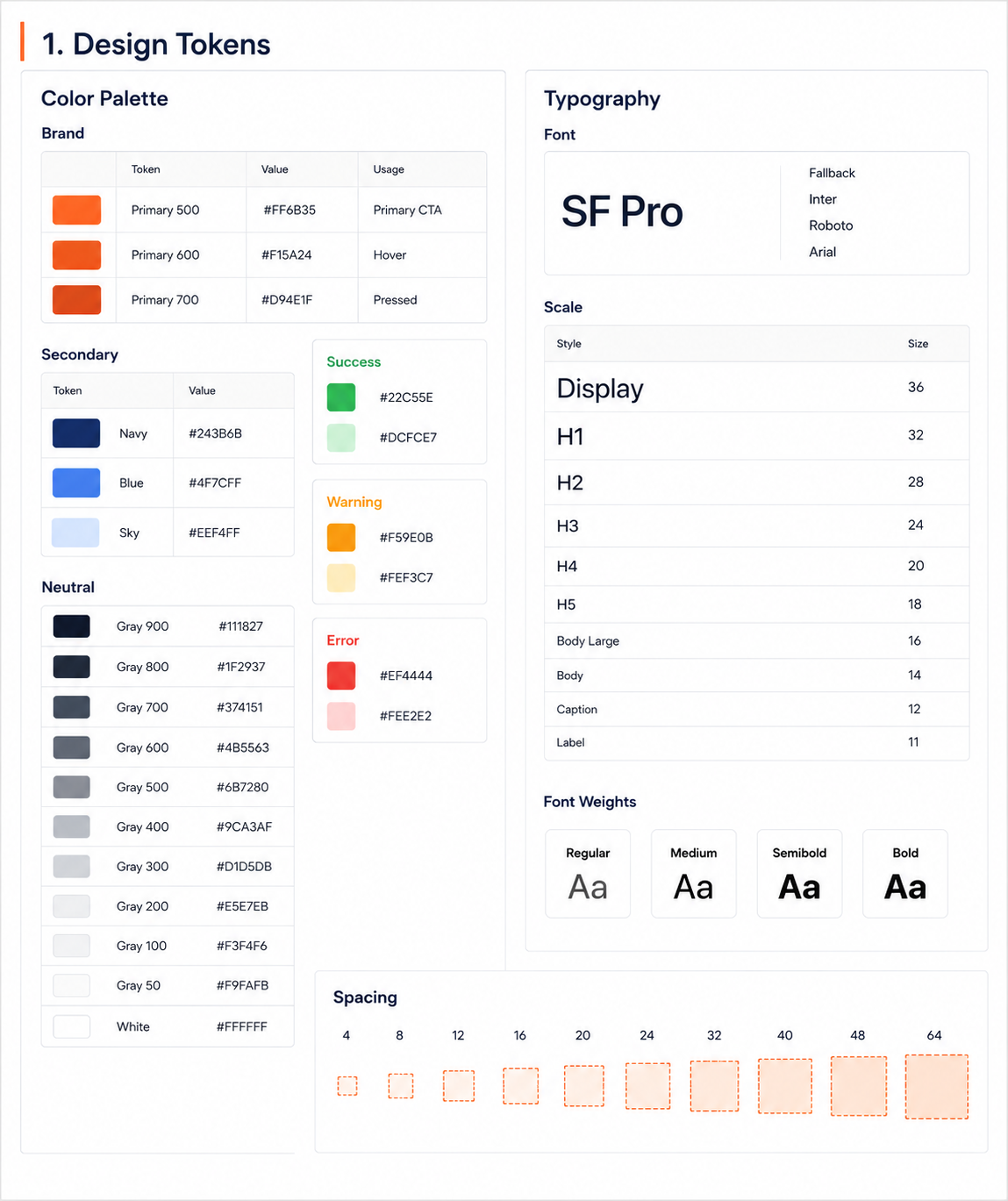
Design System
Components included template cards, validated customization fields, scheduling pickers, a preview pane, a send-confirmation dialog, analytics cards, and compliance-indicator badges.
Compliance-indicator badges got their own dedicated pattern rather than reusing the generic status-tag component, since they needed to be legible at a glance to non-technical staff and consistent everywhere a message's review state appeared — in the editor, the preview, and the audit log.
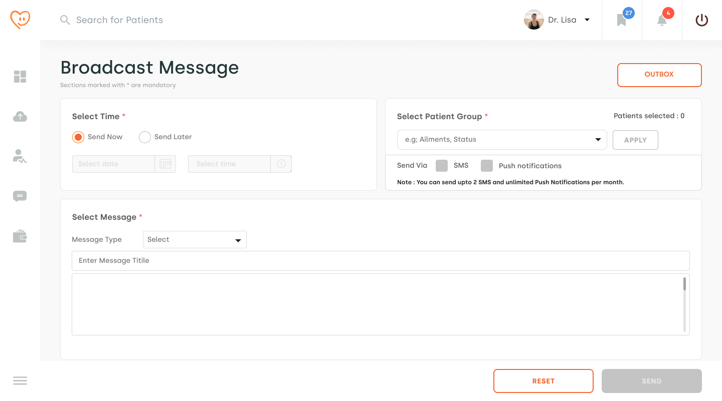
Final Design
The shipped interface has a clean template browser, customization fields that prevent common mistakes before they happen, send-time recommendations based on clinic hours and past patient engagement, and a confirmation screen that surfaces compliance status rather than hiding it behind a settings page.
Send-time recommendations default to the safest, highest-engagement window rather than the soonest available slot — reinforcing the same principle that ran through the whole project: make the safe path the fast path, not a detour from it.
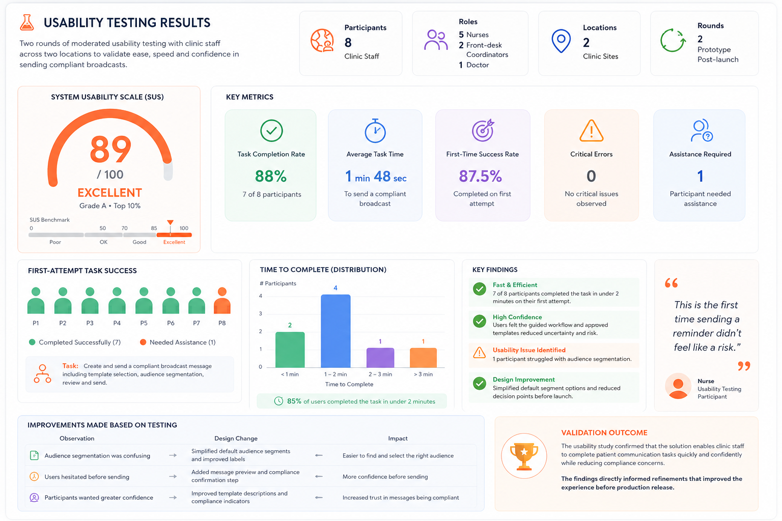
Usability Testing
I ran two rounds of moderated usability testing with 8 clinic staff members (5 nurses, 2 front-desk coordinators, 1 doctor) across two clinic locations, first on a working prototype and later on the shipped product.
- 7 of 8 participants sent a fully compliant broadcast in under 2 minutes on their first attempt.
- The one participant who didn't got stuck on audience segmentation, which led me to simplify the default segment options before launch.
- One nurse's comment stuck with me: "This is the first time sending a reminder didn't feel like a risk."
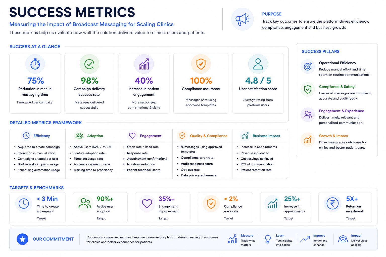
Success Metrics
The project delivered gains across efficiency, compliance, and patient engagement, measured against a clear baseline rather than assumed.
Metrics were tracked across the two pilot clinic locations over a 6-week post-launch period, compared against a 6-week baseline collected before rollout. Time-savings figures reflect staff-logged hours cross-checked against system-generated send timestamps; compliance figures reflect flags raised by the legal review process, before and after launch.