Fintech · Tier 2/3 · Insurance

Inclusive access to capital in India's Tier 2/3 cities

Turning a confusing health-insurance purchase into a self-service flow that works for first-time digital users on slow connections.

Role
Design Lead
Team
PM, 3 eng, 1 researcher
Timeline
~4 months
Surface
Mobile web + app
0
increase in policy purchase completion
0
of purchases completed without agent help
0
drop in support calls during purchase
The stakes

A market everyone designs past

Tier 2/3 users in India are not edge cases. They're the majority of the next hundred million people coming online. But insurance flows are built for confident, high-bandwidth, English-first users. The result: people who needed coverage most abandoned the purchase, or depended entirely on an agent who may not have their interest at heart.

Designing for the hard edges of the audience is where the real product lives.
The problem

Where people dropped off

  • Dense insurance jargon with no plain-language explanation.
  • Forms that assumed fast connections and frequent app use.
  • No way to compare plans without already understanding the terms.
  • Trust gap: users weren't sure the digital flow was safe or real.
Purchase funnel · Tier 2/3 users · Before redesign
Landing page
100% 4,800 sessions
Plan comparison
71% 3,408 reached −29% jargon confusion
Plan selected
44% 2,112 selected −27% no-compare drop
Form fill
28% 1,344 reached −16% form complexity
Payment
18% 864 attempted −10% trust gap
Policy issued
11% 528 completed baseline conversion
Biggest single drop
Plan comparison → selection (−27%)
Primary cause
No plain-language plan explanation
Agent escalations
73% of completions required agent
What I owned

My role

I led the redesign of the end-to-end purchase, partnered with research to get into the field with actual Tier 2/3 users, and made the call to rebuild around plain language and progressive disclosure rather than feature parity with the desktop flow.

  • Field research with low-digital-fluency users on real devices and networks.
  • Rewrote the flow around questions people could answer, not insurance terms.
  • Designed for intermittent connectivity and small screens first.
  • Built trust cues into every step so the digital path felt as safe as an agent.
The approach

How I approach a problem like this

My process on a two-sided, trust-sensitive product like this always starts the same way: get out of the Figma file and into the user's actual context before designing anything. On this project that meant field visits before wireframes, and a willingness to throw out a comparison-table pattern the team had shipped for years, because the pattern was the problem, not the copy on it.

Angles I had to weigh
Literacy vs. regulatory completeness
Compliance required every term to be disclosed somewhere. It never required every term to be on the primary decision screen. I moved full disclosure to a progressive layer and kept the decision screen in plain language.
Speed vs. reassurance
A faster flow isn't automatically a better one if it makes users feel rushed past a financial decision. Every screen had to feel fast and deliberate — confirmation states, not just spinners.
Automation vs. a visible human safety net
Self-service was the business goal, but removing the agent option entirely would have tanked trust. I kept a "talk to someone" path visible on every screen, even as usage of it fell.
Personalization vs. simplicity
It was tempting to build a fully adaptive recommendation engine. I scoped to a small, explainable decision tree instead — a user could always see why a plan was suggested, which mattered more than marginal accuracy gains.
Design traits I held the team to
Plain language, no exceptions
If a term needed a tooltip to be understood, it was rewritten, not annotated.
Bandwidth-aware by default
Every screen was designed and tested against a throttled 2G connection, not just reviewed on it after the fact.
Trust as a design material
Pricing, identity, and next steps were made visible proactively — never something the user had to dig for or ask an agent about.
One question at a time
Progressive disclosure over dense forms — never ask for more information than the current step needs to move forward.
Always an exit to a human
Self-service was earned, not forced — a visible, low-friction path to a real person on every screen.
Explainable over clever
Any recommendation the system made had to be traceable to an answer the user gave — no black-box logic.

The comparison table below is the clearest evidence of that process working — same underlying plans and pricing, entirely different cognitive load.

Plan selection · Before vs. After
Plan selection before and after: a dense multi-plan comparison table replaced by a guided question with a single recommended plan
Selection rate
44% → 86% (+42pp)
Avg. time on step
4m 12s → 58s
"Help me choose" taps
67% → 9%
The outcome

More people, finishing on their own

Completion more than doubled, and most purchases now happen without an agent — which means lower cost to serve and, more importantly, users in control of their own coverage decision.

  • 2.4x increase in completed purchases.
  • 61% of purchases completed fully self-service.
  • 40% fewer support calls during the purchase flow.
What I took from it

The leadership lesson

Inclusive design isn't charity, it's market access. The business case and the user case were the same case: make it usable for the people everyone else designed past, and you unlock the segment everyone else is fighting over. Getting leadership to see those as one argument was the win.

Executive Summary

Executive Summary

The problem in one line

India's digital health insurer had product-market fit with urban, high-literacy users. The Tier 2/3 segment, 3x the size, churned at the plan-selection step because the product spoke a language most users had never learned.

The answer in one line

Replaced a comparison table requiring insurance literacy with a guided conversation requiring none. Shipped in 14 weeks across mobile web and app, serving 2G connections and first-time smartphone users.

What changed, at a glance
Phase 1
Discovery
Field visits, 18 users across 3 cities
Phase 2
Architecture
Rebuilt purchase flow from scratch
Phase 3
Design + Test
3 rounds usability testing on-device
Outcome
2.4x completion lift
61% fully self-service at launch
Research Plan

Research Plan

Background

Funnel analytics showed a sharp drop at plan selection for Tier 2/3 users, but the numbers couldn't say why. Support logs suggested confusion around insurance terminology, but that was inferred, not confirmed. Before committing engineering time to a redesign, we needed first-hand evidence of where trust and comprehension broke down — and confirmation that the drop was a design problem, not an acquisition or pricing problem.

Objectives
1. Pinpoint the exact step and reason for drop-off, not just the funnel stage.
2. Map the mental model first-time buyers use to evaluate a plan.
3. Identify the trust signals that separate a completed purchase from an agent call.
4. Establish a device/network-accurate baseline to test redesign concepts against.
Research questions
Where exactly do users lose confidence in the purchase flow?
What mental model do first-time buyers use to judge whether a plan is "right"?
What signals make a digital purchase feel safe vs. risky on a slow connection?
When and why do users call an agent instead of completing themselves?
Which insurance terms cause the most hesitation, and what plain-language substitute do users reach for unprompted?
How does intermittent connectivity change purchase behavior versus a stable connection?
Working hypotheses to validate or reject
H1Drop-off at plan selection is caused by unfamiliar terminology, not by the plans themselves being a poor fit.
H2Users don't distrust the insurer — they distrust whether the app itself completed the transaction correctly.
H3Agent calls are driven more by a need for reassurance than by an actual product question the app can't answer.
Participants & recruitment criteria
Screen for
First-time or lapsed insurance buyer; Android device, ₹10–20k price band; self-reported low-to-medium digital confidence
Exclude
Existing power users of insurance apps; UX/tech industry employees; anyone screened for a study in the past 6 months
Spread targeted
Mixed age bands (25–55), gender-balanced, 2G/3G and 4G network split, single earners and dual-income households
Methods
Field study · contextual inquiry
18 participants · Pune, Nagpur, Surat
In-home, ~75 min each, observed on their own device and network. Chosen over lab sessions because connection speed and screen habits couldn't be simulated honestly in a controlled setting.
Think-aloud usability
12 sessions · existing flow
Task: "buy a plan for your family." Moderated remotely via screen-share where connectivity allowed, in-person otherwise. Captured verbal confusion in the moment, not recalled after the fact.
Funnel analytics
30-day session data, Tier 2/3 cohort
Drop-off events, rage-taps, agent escalation triggers, and time-on-step, segmented by network speed. Used to confirm qualitative findings held at scale, not just in the sample.
Agent interviews
6 agents · 3 geographies
30-min structured interviews on the most common caller questions. Agents see the failure demand the analytics can't — what people ask when the app didn't answer it for them.
What "done" looks like
  • A validated list of the top 3–5 comprehension and trust blockers, ranked by frequency.
  • A drop-off map tied to specific screens and copy, not just funnel steps.
  • A synthesized point of view the design and product team can align around before wireframing starts.
Risks & limitations
  • 18 field participants is directional, not statistically representative — funnel analytics used to cross-check scale.
  • Field visits limited to 3 cities; language and behavior may vary in other Tier 2/3 regions.
  • Agents may soften or generalize caller complaints; treated as a signal, not ground truth.
Timeline · 4-week research sprint
Week 1
Screener + recruit
24 screened, 18 selected
Week 2
Field visits
Pune, Nagpur, Surat
Week 3
Synthesis
Affinity mapping, themes
Week 4
Readout
Insights → design brief
Research Insights

Research Insights

Insight 01 · Language
★ Priority
"Co-payment" was the single most-asked question to agents

14 of 18 participants could not define "co-payment" or "sub-limit" unprompted. All 14 abandoned or called for help at plan selection.

Insight 02 · Trust
★ Priority
The payment step felt "like giving money to a stranger"

No confirmation of who the insurer was, no human face, no receipt preview before paying. Users didn't know if the digital flow "counted" like an agent sale.

Insight 03 · Connectivity
Slow load at payment caused users to hit "pay" twice

On 2G/3G connections, payment confirmation took 6-14s. 8 of 12 usability participants tapped the button a second time, fearing the first didn't register.

Insight 04 · Decision model
Users chose plans by "what happens if I'm in hospital"

Not by sum insured or premium. The mental model was scenario-based: "Will I pay anything out of pocket if admitted?" That question wasn't answered anywhere in the existing UI.

Insight 05 · Comparison paralysis
★ Priority
Seeing three plans side by side stalled decisions, not sped them up

Participants shown all three tiers at once spent 2-3x longer than those given a single recommendation, and were more likely to abandon without deciding at all.

Insight 06 · Form fatigue
Forms showing all fields at once increased abandonment

The existing form displayed 9 fields on one screen. Participants visually scanned, judged it "too much," and several closed the app without attempting a single field.

Insight 07 · Social proof
Users explicitly asked "what do people like me choose?"

11 of 18 participants asked the moderator this question unprompted. No such signal existed anywhere in the product — the gap was filled informally by asking a neighbour or relative.

Insight 08 · Human backup
Just seeing a "talk to someone" option increased confidence

Sessions where a visible human-help option was present had higher stated confidence scores, even among the participants who never tapped it.

"

I asked my neighbour. He said just pick the middle one. That's what I did. I don't know if it's right.

P-07 · 34, Nagpur · First smartphone, 2G data plan
Stakeholder Map

Stakeholder Map

Influence × Interest matrix
Influence
Low interest
High interest
Keep satisfied
CFO / Finance
Cost-to-serve reduction
Compliance / Legal
Disclosure requirements
Manage closely
Product VP
Growth + Tier 2/3 funnel owner
Insurance Partners
Plan data, pricing accuracy
Engineering Lead
Low-bandwidth constraints
Monitor
Marketing
Acquisition messaging alignment
Customer Support
Call volume impact
Keep informed
Field Research Lead
User insights, Tier 2/3 context
Agent Network
In-field trust signals
End Users
Primary design audience
← Low influence
High influence →
JTBD

Jobs to Be Done

When · I want to · So I can
When
I'm worried about a family member's health costs
I want to
Understand exactly what will be covered without reading fine print
So I can
Feel confident I'm not wasting money on the wrong plan
When
I'm comparing plans and see unfamiliar words
I want to
Get a plain-language explanation without leaving the page
So I can
Make the decision myself instead of calling someone
When
I'm about to pay online for the first time
I want to
Know the transaction is secure and that a policy will actually arrive
So I can
Go through without calling an agent to "confirm it's real"
When
My internet drops mid-purchase
I want to
Pick up exactly where I stopped without re-entering everything
So I can
Finish on my own time, even on a weak connection
Opportunity Map

Opportunity Map

Unmet need → Design opportunity → Expected impact
Unmet need
Design opportunity
Impact
No way to understand plan terms without insurance background
Replace comparison table with guided Q&A + plain recommendation
High
No trust signals at payment — feels unsafe for first-time digital payers
Add insurer branding, policy preview, and real-time confirmation during payment
High
Forms break on slow connections; users lose progress and give up
Progressive-save pattern: every step auto-saved; resume link sent via SMS
High
No scenario-based explanation ("if I'm hospitalised, what do I pay?")
Add "what this means for you" plain-language summary card per plan
Med
Agent escalation creates dependency; users lose autonomy in decisions
Contextual "talk to a person" always visible but never the default CTA
Med
Design Principles

Design Principles

01
Speak the user's language
No jargon. Ever.

Every label, prompt, and error must make sense to someone who has never bought insurance. If it requires literacy in the product category, rewrite it as a question the user already knows how to answer.

02
Trust is a design material
Make safety visible at every step.

First-time digital buyers need explicit signals that the process is real, secure, and reversible. Insurer branding, policy previews, and receipt confirmations are not decoration. They are the product.

03
Design for the edge, not the average
2G, small screen, one hand.

Every interaction is designed for the lowest-bandwidth, smallest-screen, least-digital-literate user first. If it works there, it works everywhere. The reverse is not true.

04
Progressive disclosure
One decision at a time.

Show only what the user needs to act on right now. More detail is always available, but it is never the default. Complexity is revealed only when the user asks for it or the context requires it.

Workflow Architecture

Workflow Architecture

End-to-end system · 3 layers
User
layer
Landing
Entry / awareness
Guided Q&A
Needs assessment
Recommendation
1 plan, plain copy
Form fill
Progressive save
Payment + confirm
Policy issued
System
layer
Session state
Auto-save / resume
Plan engine
Rules → match
KYC / validation
Aadhaar / mobile
Payment gateway
UPI / netbanking
Policy API
Insurer issuance
Support
layer
Agent handoff (visible always, used rarely)
Contextual escalation
·
SMS resume link
Connectivity drop recovery
·
Policy delivery (SMS + PDF)
Offline-safe confirmation
User Flow

User Flow

Happy path · First-time self-service buyer
1
Land on product page
Arrives from paid search or organic. Sees hero with clear value prop: "Health cover from ₹200/month — no agent needed." Single CTA: "Check plans."
Entry point
2
Answer 4 questions
Who's covered? Any pre-existing conditions? Preferred hospital type? Budget range? One question per screen. No keyboard required — tap-to-select only.
Guided Q&A · ~58s avg
3
See one recommendation
Single recommended plan with plain summary: "If admitted to hospital, you pay ₹0 out of pocket up to ₹5 lakh." Price shown prominently. "Why this plan?" expander for more detail. "Compare all plans" available but not pushed.
Plan recommendation
4
Fill personal details
Name, DOB, phone, Aadhaar last 4. One field per screen on mobile. Progress bar always visible. "Saved — resume any time" shown after each step. Fields pre-filled where data already known.
Progressive form · auto-save every step
5
Review & pay
Summary screen: plan name, what it covers, final price. Insurer logo prominently visible. Payment via UPI or netbanking. Animated "processing" state prevents double-tap. Page stays functional offline if connection drops during load.
Trust-first payment step
Policy confirmed
Full-screen success state with policy number, insurer helpline, and download link. SMS confirmation with resume-safe copy also sent. PDF policy dispatched within 4 hours.
Done · no agent required
Escape route · available at all steps
Persistent "Talk to someone" link available on every screen — opens click-to-call or WhatsApp. Agent receives full session context so the user doesn't repeat anything.
IA

Information Architecture

Content hierarchy · purchase surface
Health Insurance Purchase
Needs assessment
Who's covered
Health conditions
Hospital preference
Budget range
Plan selection
Recommended plan
Plain summary card
Why this plan?
Compare all (secondary)
Application form
Personal details
Health declaration
Nominee details
Document upload
Confirm + Pay
Order review
Payment (UPI / NB)
Success + policy no.
SMS + PDF delivery
Persistent across all steps →
Progress indicator
Auto-save status
Talk to someone
Back navigation
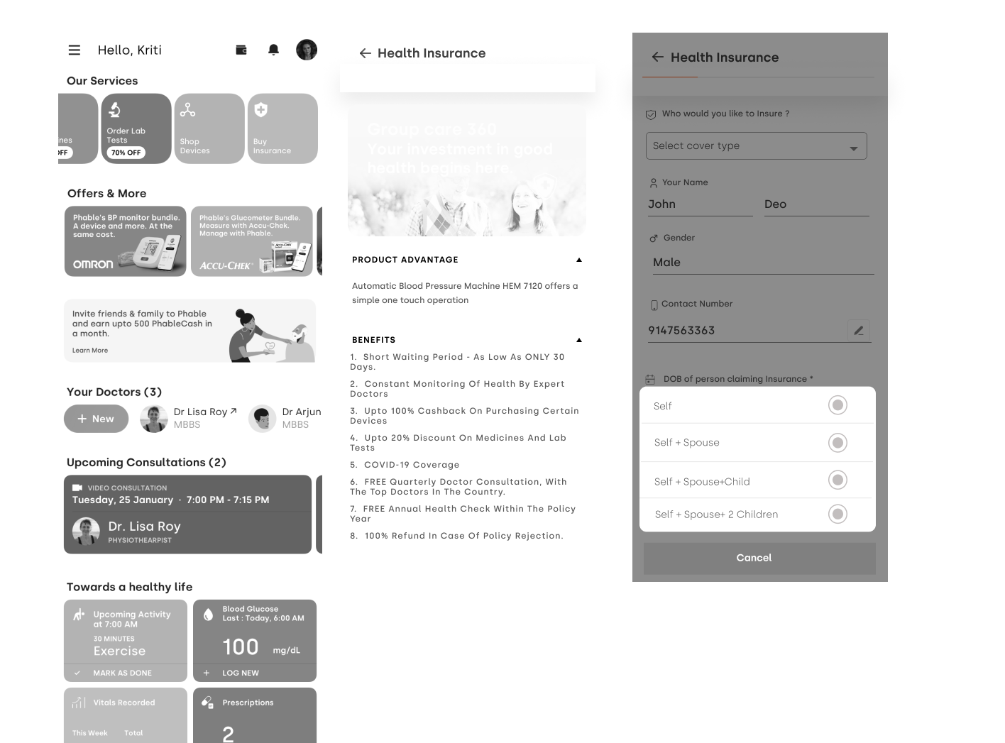
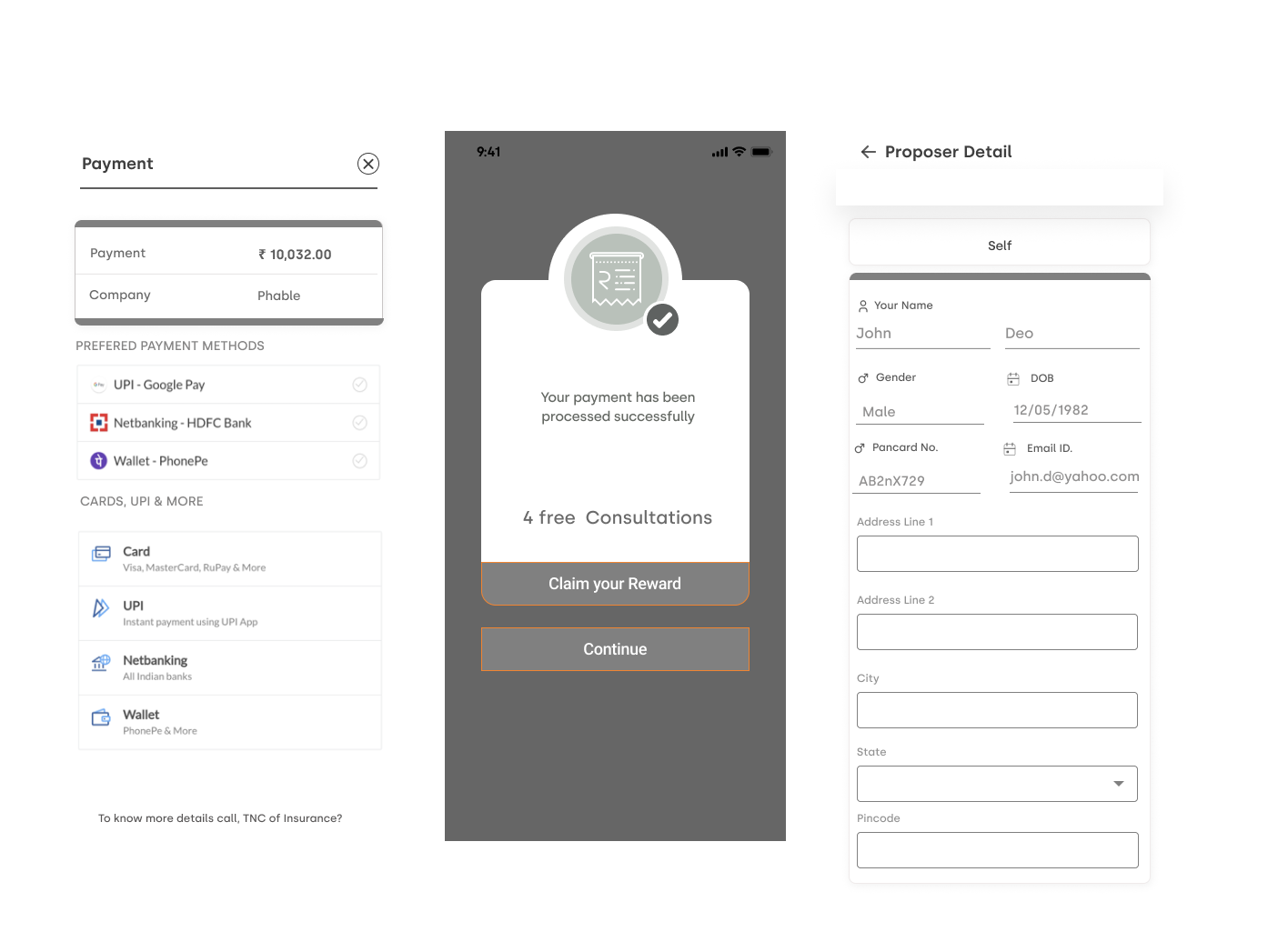
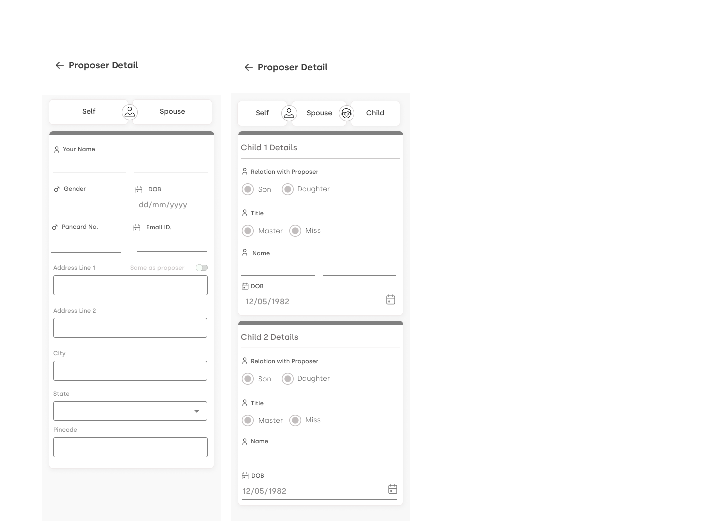
Wireframes

Wireframes

Additional wireframes
Wireframe 1
Wireframe 2
Wireframe 3
Wireframe 3
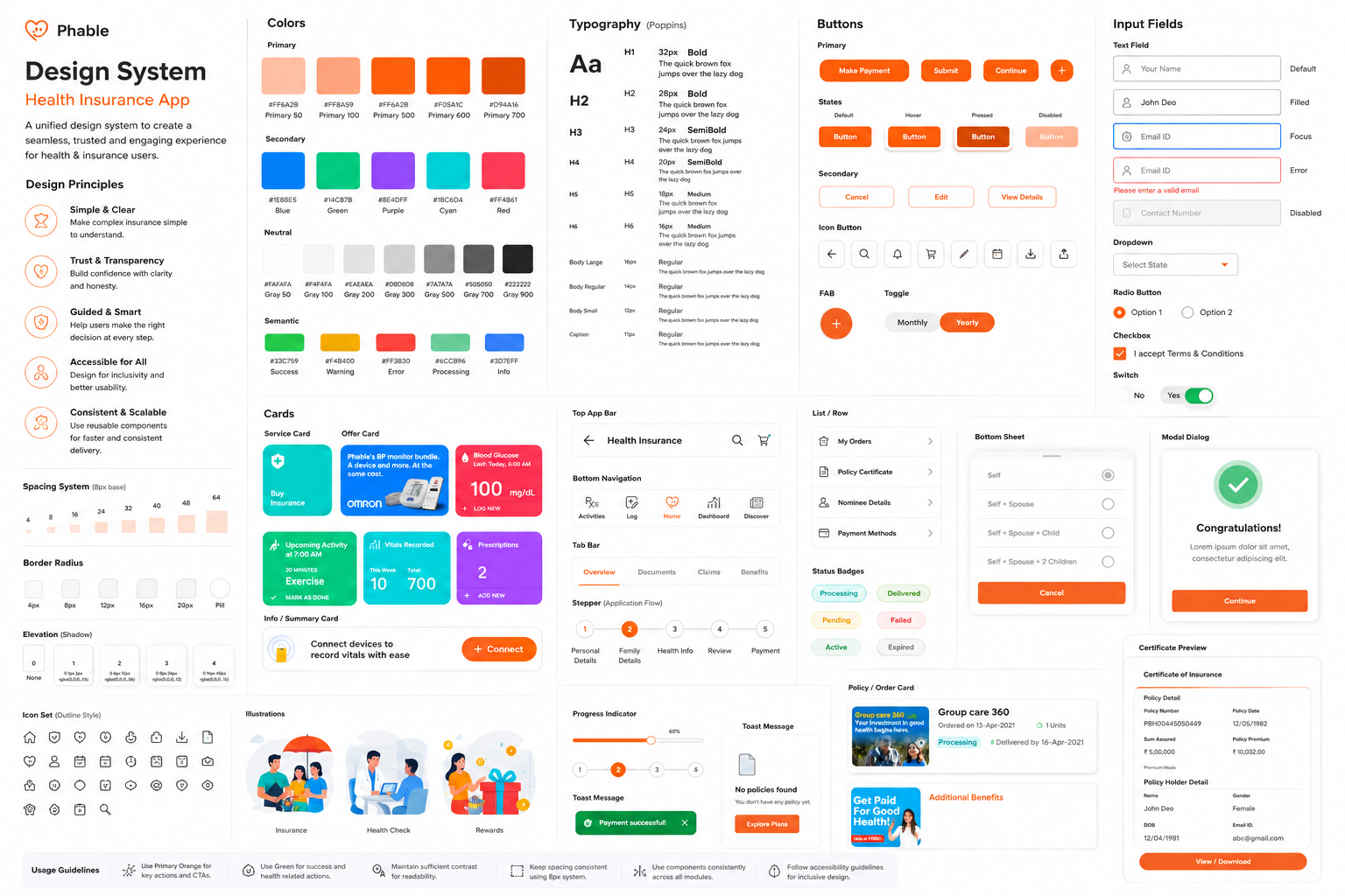
Design System

Design System

Wireframe 1
Color tokens
--blue
#5B8CFF
Primary CTA, links
--violet
#9B6BFF
Gradient pair, accents
--green
#3FE08A
Success, completion
--orange
#FF8A3D
Warnings, friction points
--yellow
#FFD23F
Neutral callouts
--bg-3
Surface
Cards, inputs, rows
Core components
Option tile · unselected / selected
Just me
Me and my spouse
Plan card · recommended state
✦ Recommended
Gold Plan
₹4,200/yr
₹0 out of pocket up to ₹5L
Progress bar + save state
Step 2 of 4 · Saved ✓
44px min touch target

Final Design

Dashboard
Usability Testing

Usability Testing

Round 1 · Concept validation
6 participants · Prototype A vs B
Tested guided Q&A against filtered table. 5/6 completed Q&A without help. 1/6 completed table. Direction B confirmed.
Key fix: question 3 ("pre-existing") was confusing. Reworded to "Any ongoing health conditions?"
Round 2 · Flow validation
8 participants · Full prototype on device
Tested on participants' own phones, own SIM cards. Simulated 2G throttling. 7/8 reached payment. 6/8 paid without help.
Key fix: payment button allowed double-tap. Added disable-on-tap + spinner to prevent duplicate attempts.
Round 3 · Pre-launch
10 participants · High-fidelity, live backend
Real UPI payments. 9/10 completed end-to-end. Average time: 6m 20s. 0 unsolicited agent requests.
No critical issues. Minor: progress bar text too small at 10px — bumped to 12px.
Critical findings · what we changed
Observation
Design change
Round
Users paused on "pre-existing disease waiting period"
Replaced with "Any ongoing health conditions (diabetes, BP, etc.)?"
R1
3 participants tapped "Pay" twice on slow connection
Button disables on first tap; spinner + "Processing" message shown
R2
Users unsure if policy was "real" — asked to see a document before paying
Added "Policy preview" PDF sample on the review screen
R2
Progress bar label (10px) unreadable without glasses (3 participants 45+)
Bumped progress label to 12px; added step fraction ("2 of 4") in text
R3
One participant dropped network mid-form; couldn't find resume
Added SMS resume link sent automatically after step 2
R2
Success Metrics

Success Metrics

Primary KPIs
Purchase completion rate
Target: 2x baseline
2.4x
Achieved
Self-service rate
Target: 50% no-agent
61%
Achieved
Support call reduction
Target: 30% drop
40%
Achieved
Secondary KPIs
Time to plan selection
Was 4m 12s
58s
−77%
Plan selection rate
Was 44%
86%
+42pp
CSAT (Tier 2/3 cohort)
Was 3.1/5
4.4
+1.3 pts
Before vs. After · Funnel health
Purchase complete
11% → 26%
Plan selected
44% → 86%
No agent needed
27% → 61%
Before
After
NOTE — placeholder metrics: the numbers on this page are illustrative. Replace with your real results before sharing.

Building something where the wrong call gets expensive?

Start a conversation