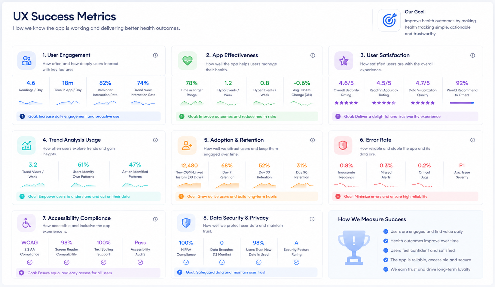
MHealth Trizetto
Turning sick care into proactive care — a patient app and practitioner app built around one question: how do you get a CGM-synced diabetic patient, their doctor, and a front desk to see the same risk at the same time?
A diabetic patient's risk shouldn't live in three different places
CGM-synced apps already existed. They synced with a device and pushed a glucose-trend notification. What none of them did was connect that reading to an actual care loop — the doctor, the hospital front desk, and a nearby family member seeing the same high-risk signal at the same time, with a path to act on it. The biggest challenge wasn't data collection. It was getting a critical alert from a patient's body to a doctor's appointment dashboard before it became an emergency.
Sick care, not health care
- Appointment booking based on disease and specialty was slow, confusing, or simply unavailable when it mattered.
- Health monitoring was fragmented across disconnected devices and paper — no single view of a patient's actual status.
- Generic health tips and generic risk thresholds ignored the individual — personalization was close to zero.
- Doctors had no reliable, real-time way to know which of their patients needed attention right now versus at the next scheduled visit.
I hypothesized that the opportunity wasn't a better CGM-sync notification — it was a human-centered design process layered on top of the device data that already existed, connecting patient, doctor, and family into one loop.
My role as lead interaction designer
I executed all facets of interaction design — information architecture, task flows, interaction and visual design, product decisions, and prototyping — across both the patient-facing and practitioner-facing apps. Research wasn't handed to me as a brief; I ran it.
- Conducted interviews, surveys, and focus groups to surface both user behavior and attitude, not just stated preference.
- Supported qualitative findings with Google Analytics data analysis.
- Narrowed scope to two primary user groups: adults with Type 1/Type 2 diabetes, and parents caring for a child with Type 1.
- Designed the high-risk alert path connecting patient, doctor, hospital front desk, and family member.
Lean research, real stakeholders in the room
The process followed a lean UX methodology — research, prototyping, mockups, usability testing, and documentation, kept tight enough to stay cost-effective without cutting the rigor that mattered. To get internal support and keep the design grounded in operational reality, I assembled stakeholders from Interactive Health spanning IT, health services, software development, and marketing, alongside two project leads and two designers from our own team.
The multidisciplinary group wasn't ceremonial — it meant a compliance concern or a clinical workflow constraint surfaced in week two of research, not after the first prototype was already built around an assumption that wouldn't survive contact with a real hospital front desk.
Two apps, one connected loop
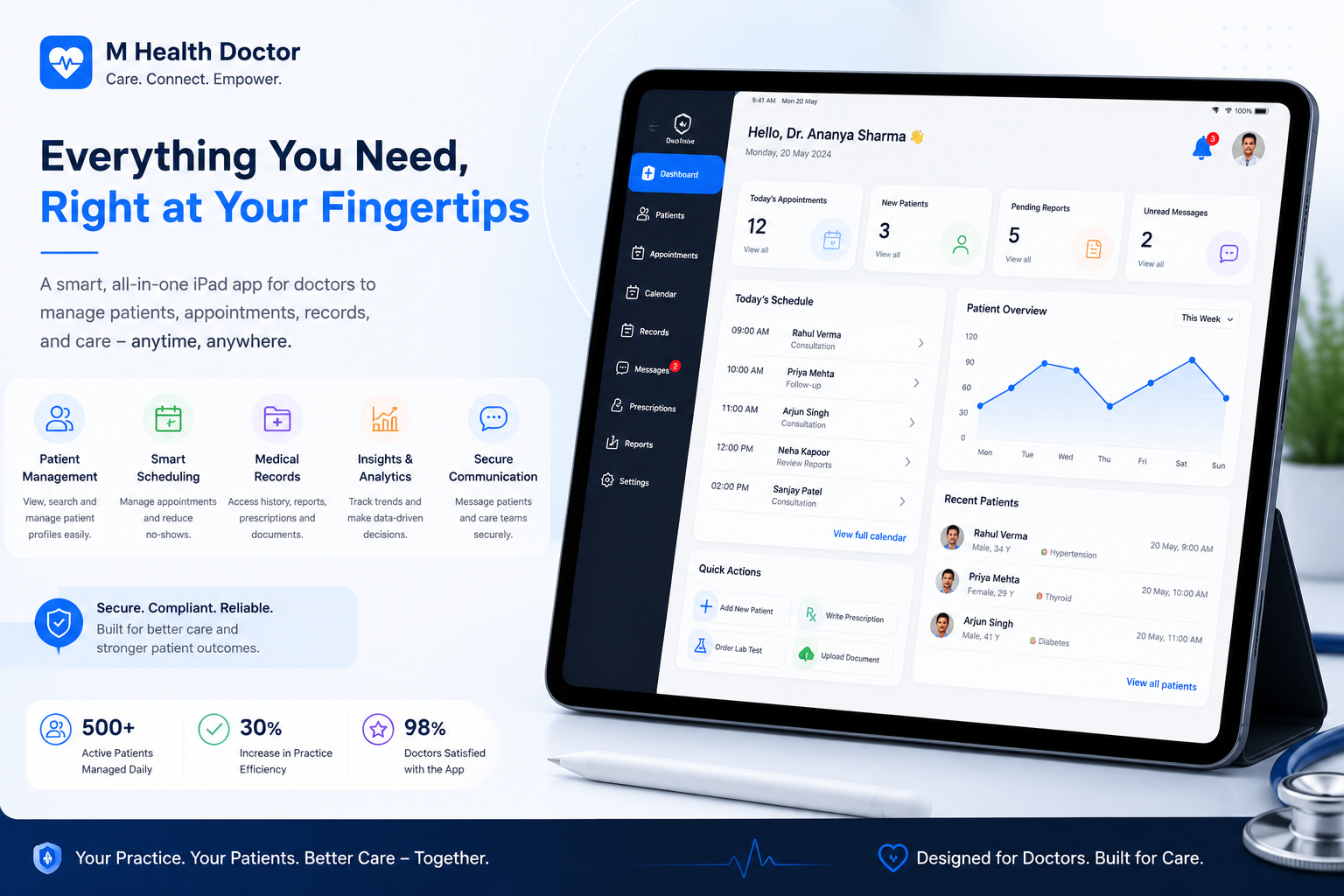
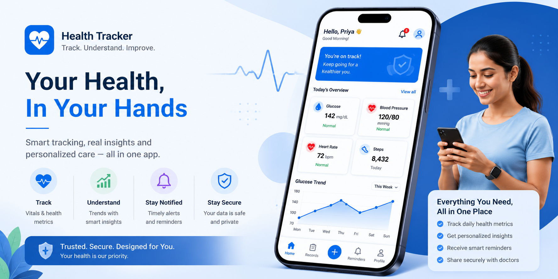
The result was two purpose-built apps functioning as one system: a Patient app for monitoring, booking, and wellness engagement, and a Practitioner app giving doctors a prioritized, risk-aware view of their patient list instead of a flat appointment calendar.
- Patients track blood pressure, glucose, and wellness metrics from third-party devices in one place.
- High-risk readings automatically alert the doctor, hospital front desk, and a nearby family member — not just the patient.
- Practitioners get a high-risk individual notification queue instead of discovering risk during a routine visit.
- A gamified Kinitics Wellness integration ties healthy behavior to redeemable points, including medication refills.
Personalization is a retention feature, not a nice-to-have
The clearest research signal across both interviews and secondary research was the same complaint in different words: generic advice gets ignored. A cat owner ignores dog-wellness tips; a patient managing osteoarthritis ignores a generic "walk more" push. The lesson that shaped every downstream decision was that relevance beats reach — a smaller set of recommendations tied to a person's actual profile outperformed a larger set of generic ones, every time we tested it.
The short version
Risk lived in silos
A patient's glucose spike, a doctor's calendar, and a family member's awareness never connected — sick care instead of proactive care.
One connected loop
A Patient app and Practitioner app sharing real-time risk data, so a high-risk reading reaches the doctor, front desk, and family automatically.
Proactive, not reactive
Personalized monitoring, streamlined booking, and a gamified wellness loop replacing generic advice and disconnected tools.
Two purpose-built apps, one shared goal: give patients and practitioners the same real-time picture of risk, instead of discovering it after the fact.
What the two apps actually do
Monitor, book, stay informed
Blood pressure and glucose monitoring, appointment management, health alerts for status/appointments/refills, wellness programs, and health manager tips.
Prioritize, don't just schedule
All-appointments listing, high-risk individual notifications, prescription and case history, patient visit detail, and new prescription issuance.
Both apps share one goal: move the relationship from reactive sick care — see a doctor after something's wrong — to proactive, preventive health management where risk is visible before it becomes urgent.
Why this was worth building
$639.4B
Projected global digital health market value by 2026 — the growth case for investing in remote monitoring.
40% fewer readmissions
Engaged patients show measurably fewer hospital readmissions, saving an estimated $5,000 per patient per year.
$3.7T
Estimated healthcare spending preventive care could save over a decade through earlier detection and intervention.
Gamification lift
Leaderboards, badges, and points correlate with a 35% increase in engagement and a 30% increase in behavior change.
Monetization path
The Kinitics Wellness integration supports both paid and free subscription tiers alongside the core app.
What made this hard
Real-time, cross-device reliability
Data security, real-time monitoring, and consistent behavior across devices and platforms — none of which are optional in healthcare.
HIPAA, not as an afterthought
Sensitive patient data requires privacy safeguards built into the design from the first flow, not bolted on before launch.
EHRs and insurance data don't line up
Connecting to existing health records and insurance databases for accurate, current information was a genuine interoperability problem, not a UI problem.
Primary and secondary research
Narrow a broad hypothesis — that human-centered design could improve on existing CGM-synced apps — into a specific, buildable interaction model. The research had to answer two separate questions: what do patients actually need day to day, and what does a doctor need to see to act on a risk signal before it becomes an emergency.
Adults with Type 1 or Type 2 diabetes
Direct daily experience managing glucose, medication, and appointments.
Parents caring for a child with Type 1
Different stakes and workflow — caregiving on someone else's behalf, often across school and home.
In-person interviews + observation
Contextual, not lab-based — watching how people actually interacted with a CGM device or existing app in their own routine, not a scripted task.
Literature, forums, experts
Studies and books on diabetes technology, real user comments on forums and blogs, and conversations with medical professionals, authors, and researchers.
Google Analytics
Quantitative usage data cross-checked against qualitative interview findings to see whether stated behavior matched actual behavior.
Active condition management
Currently managing Type 1/Type 2 diabetes personally, or actively caring for a child who is — not a lapsed or newly diagnosed case.
Mixed device familiarity
Both existing CGM/app users and people managing manually on paper, to avoid over-indexing on tech-comfortable participants.
Industry insiders
Healthcare or health-tech employees, to keep feedback grounded in lived patient experience rather than professional opinion.
Six themes from affinity mapping
The core problem underneath every interview transcript was the same: users weren't struggling with any single task — they were struggling with fragmentation. Monitoring, understanding, finding a doctor, booking, and tracking progress each lived in a different app, device, or phone call. Affinity mapping the raw research surfaced six recurring themes, each pointing at a specific UX opportunity.
Healthcare Accessibility
Finding the right doctor by disease is confusing; booking takes too many steps; trust in doctor selection is low. → Intelligent doctor discovery.
Fragmented Health Monitoring
Smartwatch, BP machine, glucose meter, sleep app, hospital reports — all separate. Trends become impossible to see. → Unified health dashboard.
Personalization
"Drink more water" gets ignored. "Your BP rose 12% in two weeks — reduce sodium, walk 20 more minutes" gets acted on. → AI-driven personalized insight.
Preventive Healthcare
Users don't want care only after illness — they want early detection and risk prediction before symptoms escalate. → Predictive health alerts.
Decision Support
Users collect data but don't know what to do with it — the largest experience gap in the entire journey. → Explainable health intelligence.
Motivation
Engagement drops off after a few weeks without progress tracking, goals, streaks, or community support. → Goals, rewards, and community.
Check metrics reactively, search symptoms after the fact, compare readings manually, ask family members, and book a doctor only once symptoms worsen.
Monitor daily, understand trends as they form, receive proactive alerts, take preventive action, and consult a doctor earlier — before a crisis.
Monitor health in one place. Find the right doctor quickly. Book easily. Track medical history. Understand reports.
Feel reassured about my health. Reduce anxiety. Gain confidence in decisions. Feel in control.
Share progress with family. Demonstrate healthy habits. Participate in wellness challenges.
From themes to six buildable concepts
Smart Health Dashboard
One Health Score with drill-down analytics, replacing dozens of disconnected metric cards.
AI Health Coach
Daily recommendations, habit coaching, medication reminders, and lifestyle suggestions.
Intelligent Doctor Finder
Filter by disease, specialty, rating, insurance, distance, and consultation mode.
Preventive Risk Detection
Predicts diabetes, hypertension, obesity, and heart disease risk before symptoms become severe.
Personalized Health Journey
Adaptive home screen based on current conditions, active goals, medication schedule, and risk level.
Family Health Management
Manage parents, children, and spouse from a single dashboard — not four separate logins.
Seven principles, one product vision
Action over information
Every metric guides the user toward a meaningful next step — not just a display of data.
One health timeline
Readings, medications, reports, appointments, and activities in a single chronological view.
Personalized by default
Recommendations tailored to each user's profile, history, and goals — never generic advice.
Reduce cognitive load
Visual trends, plain language, and color-coded indicators simplify complex medical information.
Trust and transparency
Explain how recommendations are generated, surface credible sources, and protect user privacy.
Support preventive care
Prioritize early warnings and habit formation over reactive care after symptoms appear.
Motivate continuous engagement
Reinforce healthy behaviors through goals, progress tracking, reminders, and community encouragement.
Margaret Thompson, 65
Retired, active, managing chronic conditions
High blood pressure and osteoarthritis. Independent, health-conscious, motivated to stay that way — but not a confident technology user.
Monitor, manage, stay independent
Track blood pressure and vitals, follow prescribed treatment for chronic conditions, and preserve an active daily life.
Technology isn't the comfortable part
Needs intuitive interfaces, clear visualizations she can interpret without help, and reminders that keep her motivated without nagging.
Diligent, but manual
Records blood pressure readings in a paper diary today. Visits her provider regularly and leans on family for support and encouragement.
What Margaret says, does, and feels
"I find it difficult to book appointments with doctors." "I feel overwhelmed managing my health parameters." "I struggle to remember to take my medications on time."
Downloads the app, searches doctors by specialty, reads reviews, books appointments, tracks parameters manually or via connected device, sets medication reminders.
Frustrated by booking complexity, anxious about her conditions, but hopeful and empowered when the app gives her a personalized, actionable path forward.
The booking flow and doctor profiles, reminders and notifications, visual health trend data, and ratings from other patients about providers.
Three stories that drove the flows
Health monitoring
"As Margaret, I want to track blood pressure and heart rate easily and view them clearly, so I can share trends with my doctor during appointments."
Appointment scheduling
"As Margaret, I want to see available doctors by specialty, rating, and location, pick a slot, and get reminders — without phone calls."
Personalized exercise
"As Margaret, I want low-impact exercise recommendations suited to my age and conditions, with clear demonstration videos."
From registration to reminder
The core user flow ran registration → home screen → appointment booking → health parameter tracking → personalized recommendations → wellness programs → account settings. Four task flows carried the weight of daily use:
Booking a doctor's appointment
Search by specialty → review ratings and time slots → confirm → receive notification → appointment appears in the Appointments section.
Tracking health parameters
Select parameter → enter manually or via connected device → view trend visualization → set recurring tracking reminders.
Accessing recommendations
App analyzes health data → surfaces medication, lifestyle, and wellness-program suggestions tailored to the user's specific conditions.
Managing account settings
Update personal info → manage notification preferences → connect/disconnect third-party devices → review appointment and wellness history.
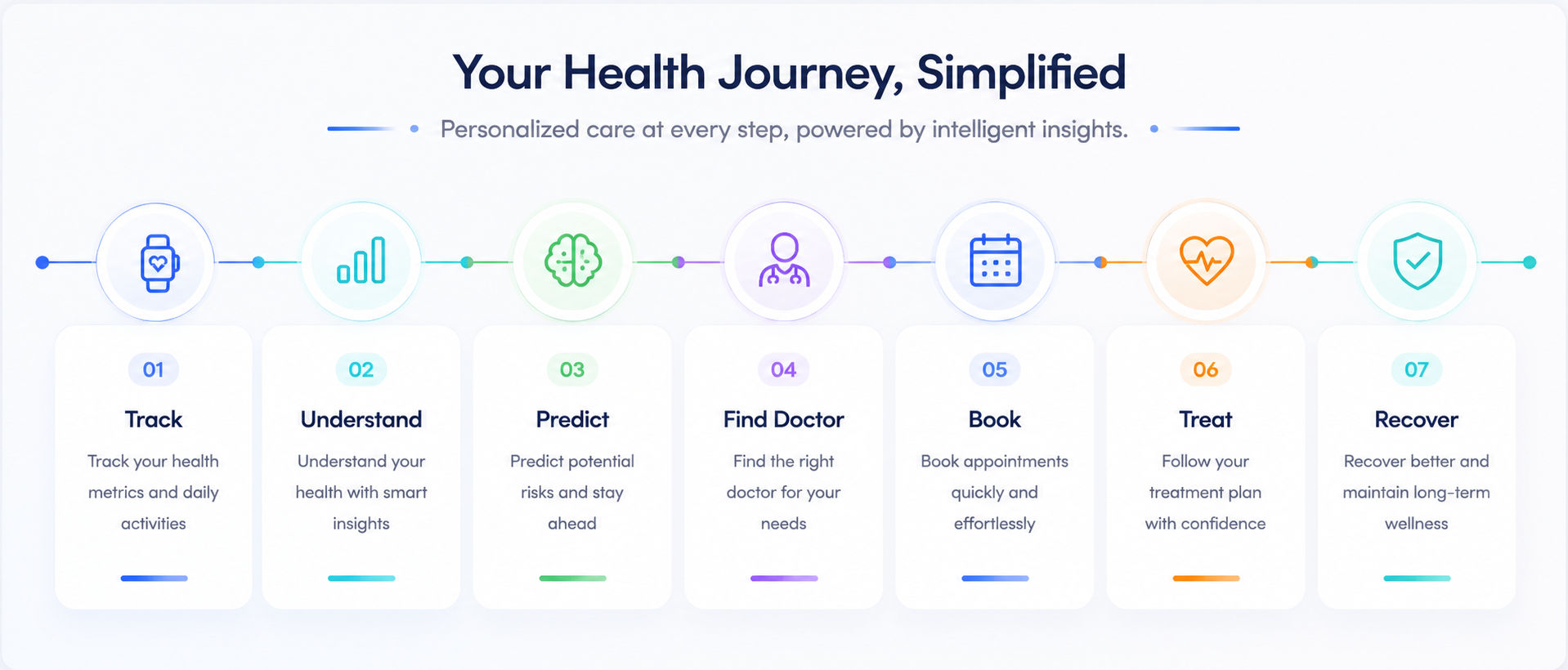
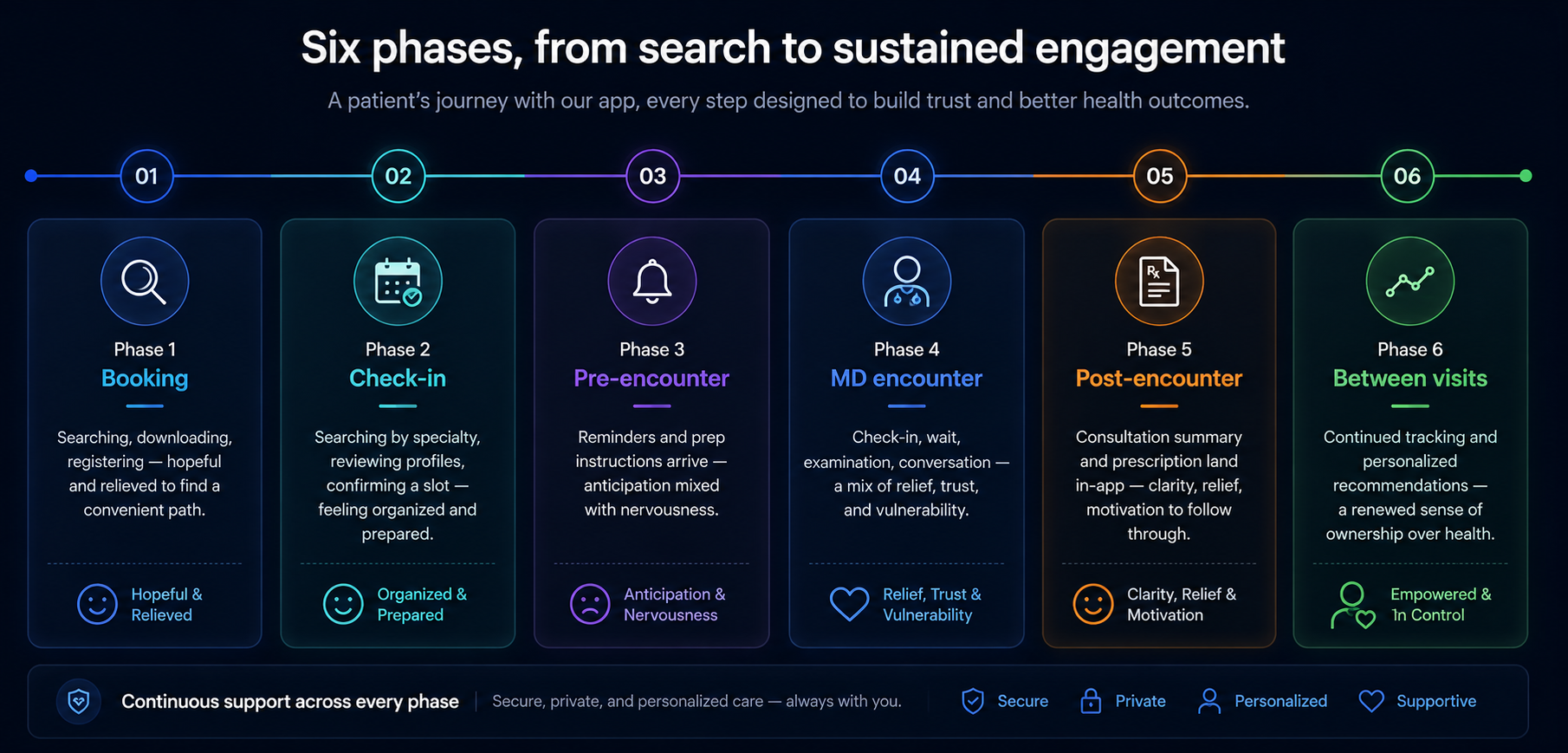
Six phases, from search to sustained engagement
Booking
Searching, downloading, registering — hopeful and relieved to find a convenient path.
Check-in
Searching by specialty, reviewing profiles, confirming a slot — feeling organized and prepared.
Pre-encounter
Reminders and prep instructions arrive — anticipation mixed with nervousness.
MD encounter
Check-in, wait, examination, conversation — a mix of relief, trust, and vulnerability.
Post-encounter
Consultation summary and prescription land in-app — clarity, relief, motivation to follow through.
Between visits
Continued tracking and personalized recommendations — a renewed sense of ownership over health.
From sketch to prototype
Design solutions started as sketches — the fastest way to explore content placement and navigation options before committing to a direction. Sketching kept the focus on content hierarchy: making sure the information a stressed, possibly first-time user needed most was never buried. Each concept was tested against the pain points surfaced in research before moving to wireframes and, eventually, a working prototype used in stakeholder review and usability testing.
What this meant for the business
Improved user experience
A more intuitive, user-friendly interface driving higher satisfaction, engagement, and retention.
Streamlined processes
Appointment booking, parameter tracking, and medication management consolidated into one workflow, cutting administrative overhead.
Enhanced communication
Secure messaging, reminders, and shared treatment plans improved patient-provider continuity of care.
Data-driven insight
Aggregated health, appointment, and medication data informed strategic decisions and targeted health programs.
Competitive advantage
Personalized recommendations and convenient access differentiated the platform from generic competitors.
Revenue potential
Premium subscriptions and wellness-program partnerships opened new monetization paths beyond the core app.
How we'd know it's working