Peer-to-peer microlending platform
Designing for trust, risk visibility, and financial inclusion at scale — balancing borrower confidence with lender risk signals.
Two sides, opposite needs, one screen
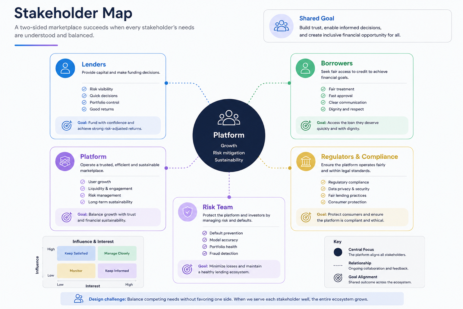
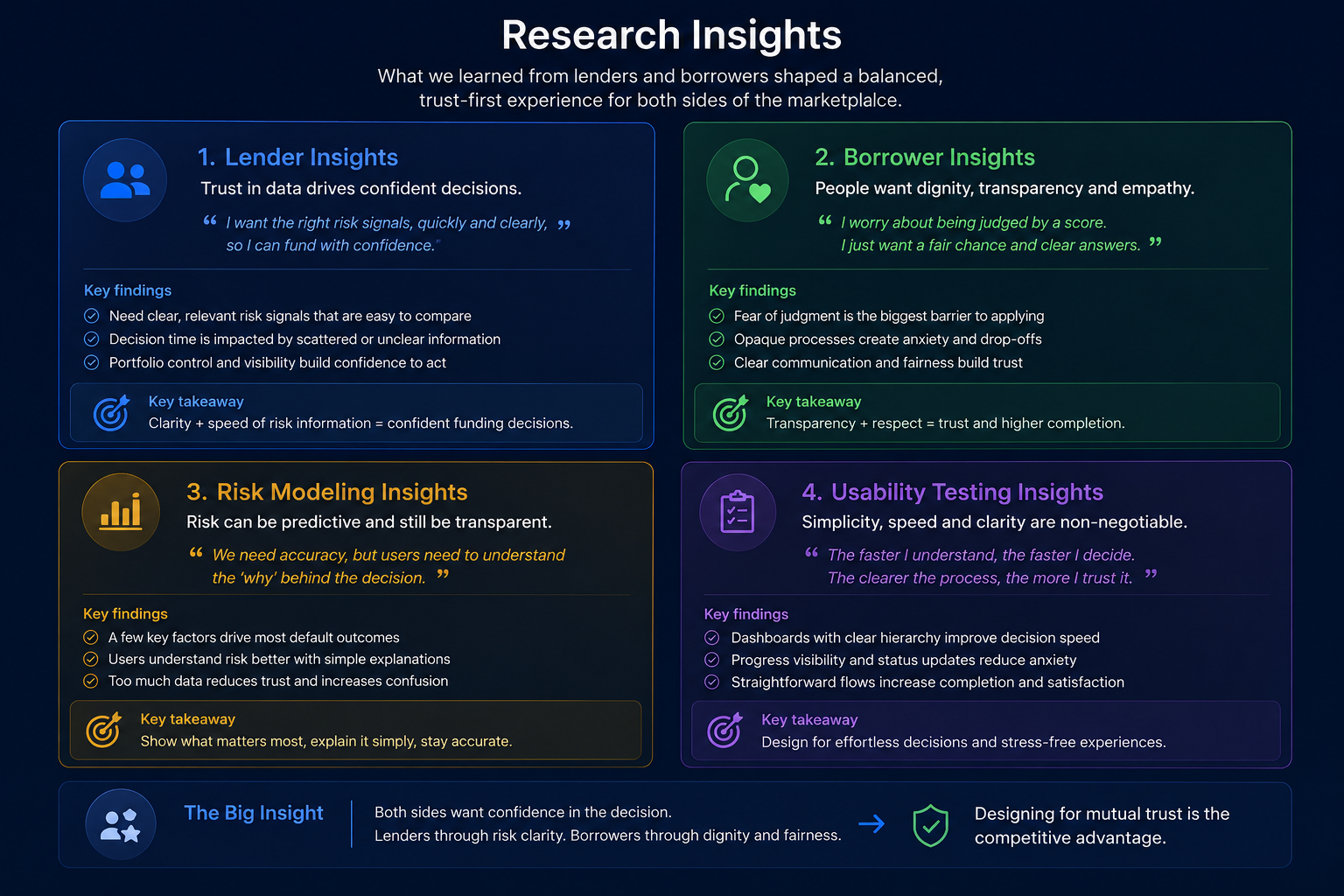
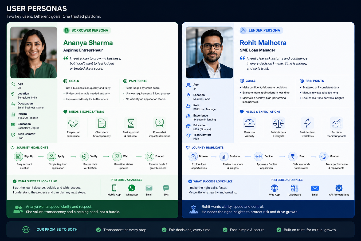
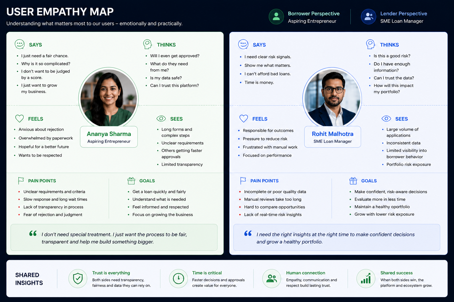
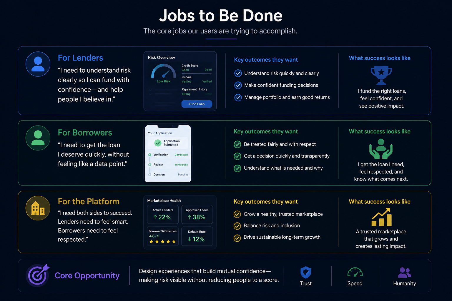
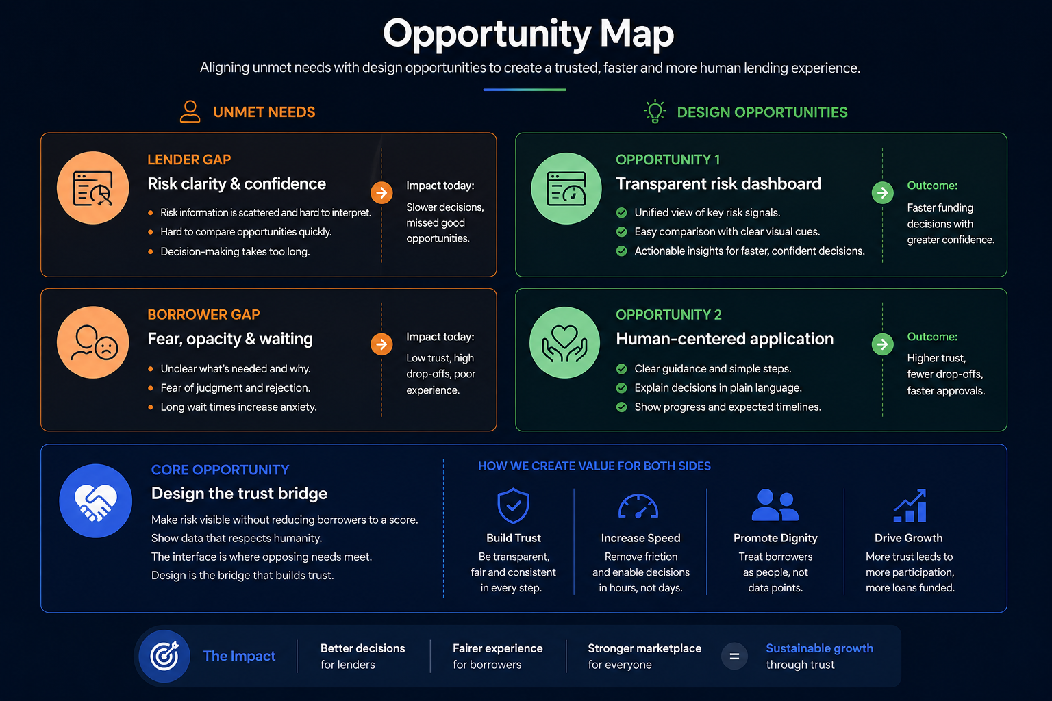
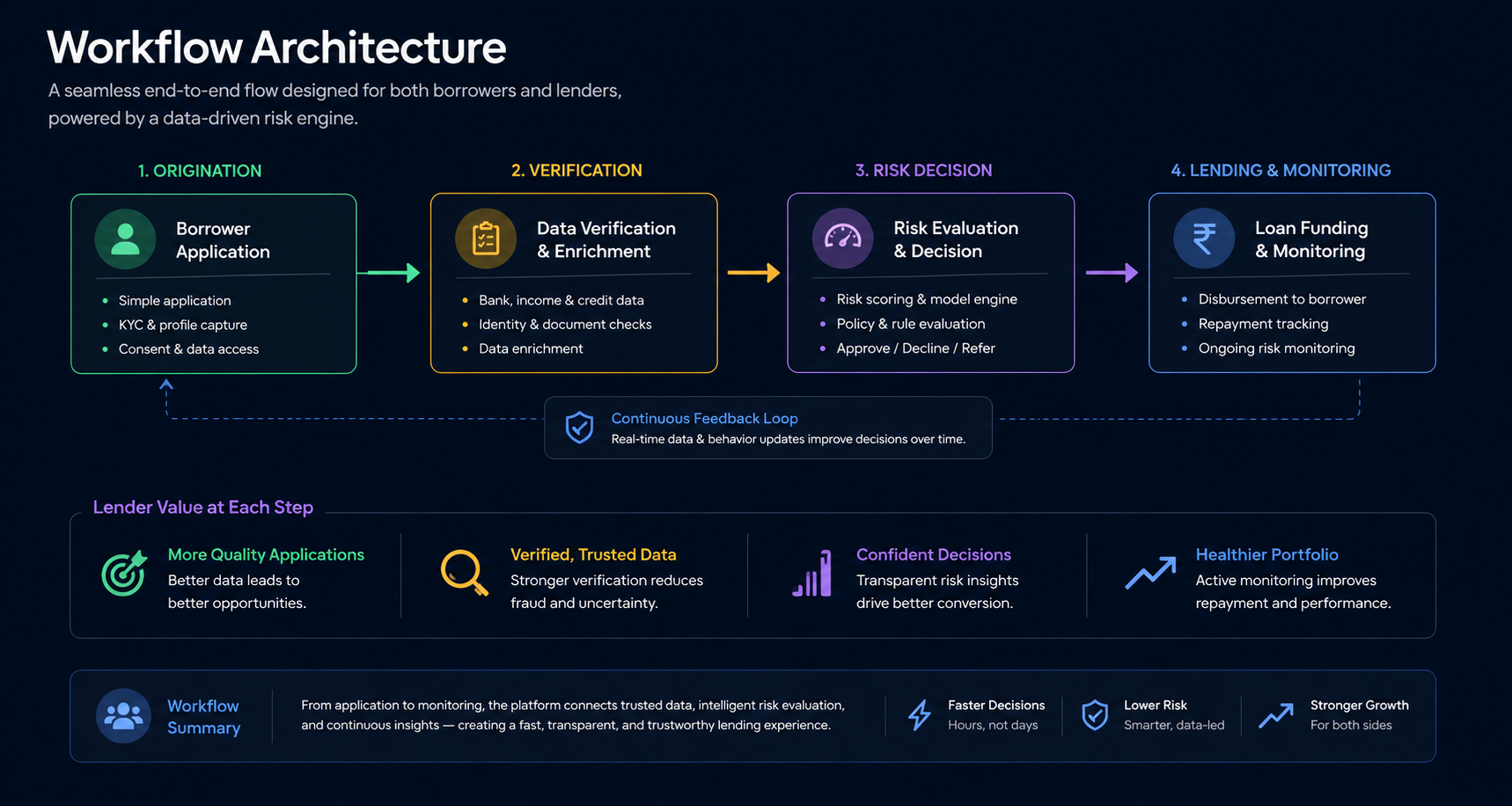
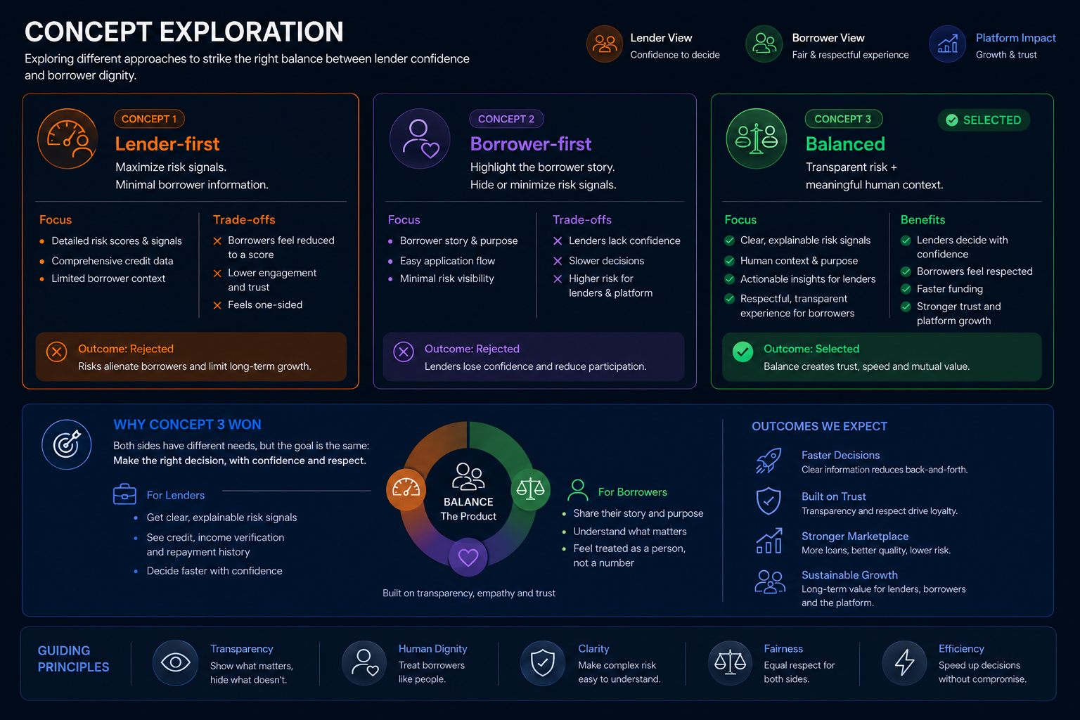
A lending marketplace has to make borrowers feel confident and respected while giving lenders enough risk signal to act. Lean too far toward the borrower and lenders pull out; lean too far toward the lender and you exclude the people the platform exists to serve.
My role
I led design across both sides of the marketplace, owning the risk-visibility model for lenders and the dignity of the borrower experience. The central design tension was making risk legible without making borrowers feel reduced to a score.
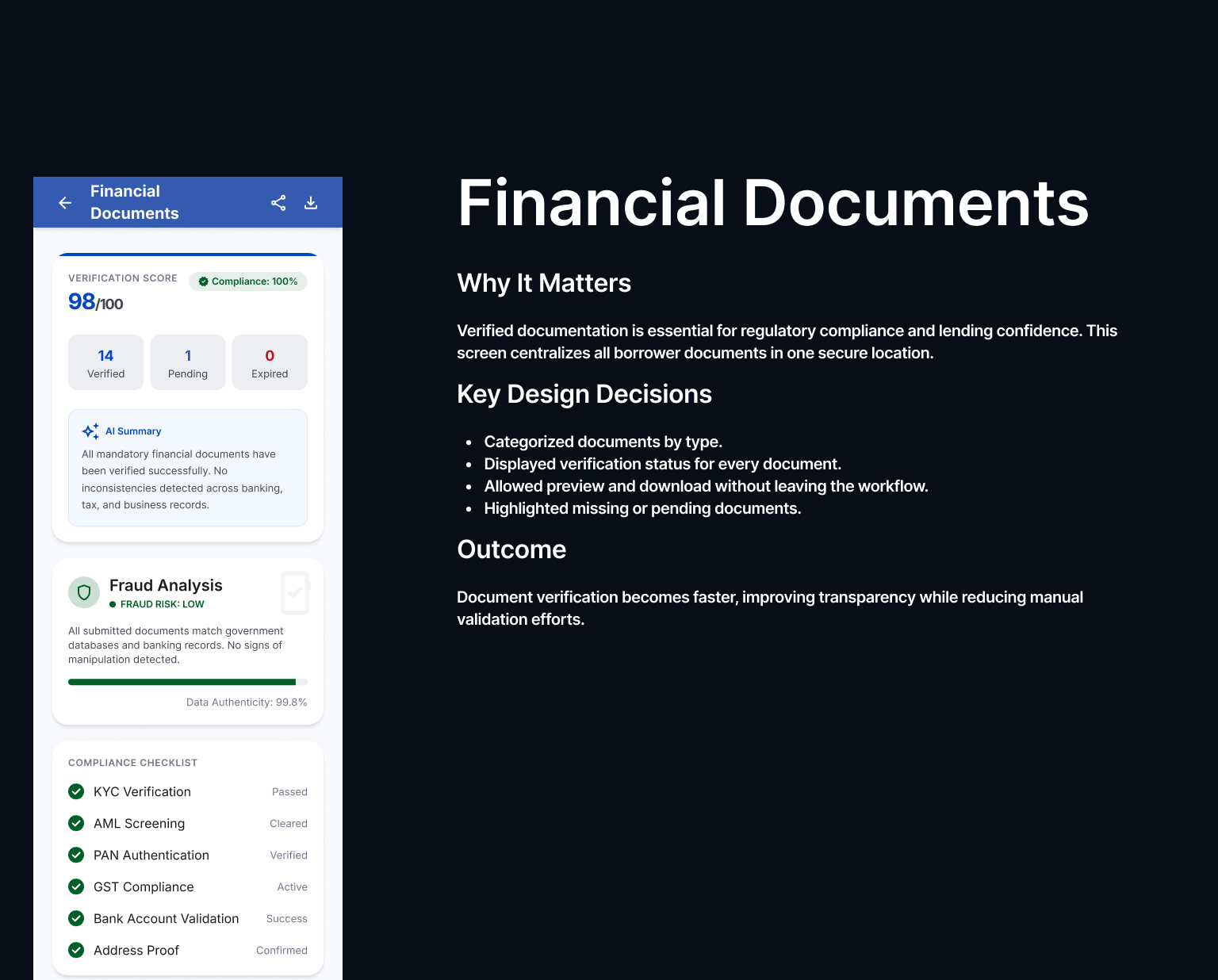
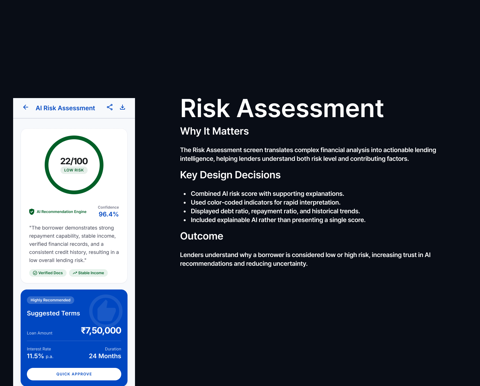
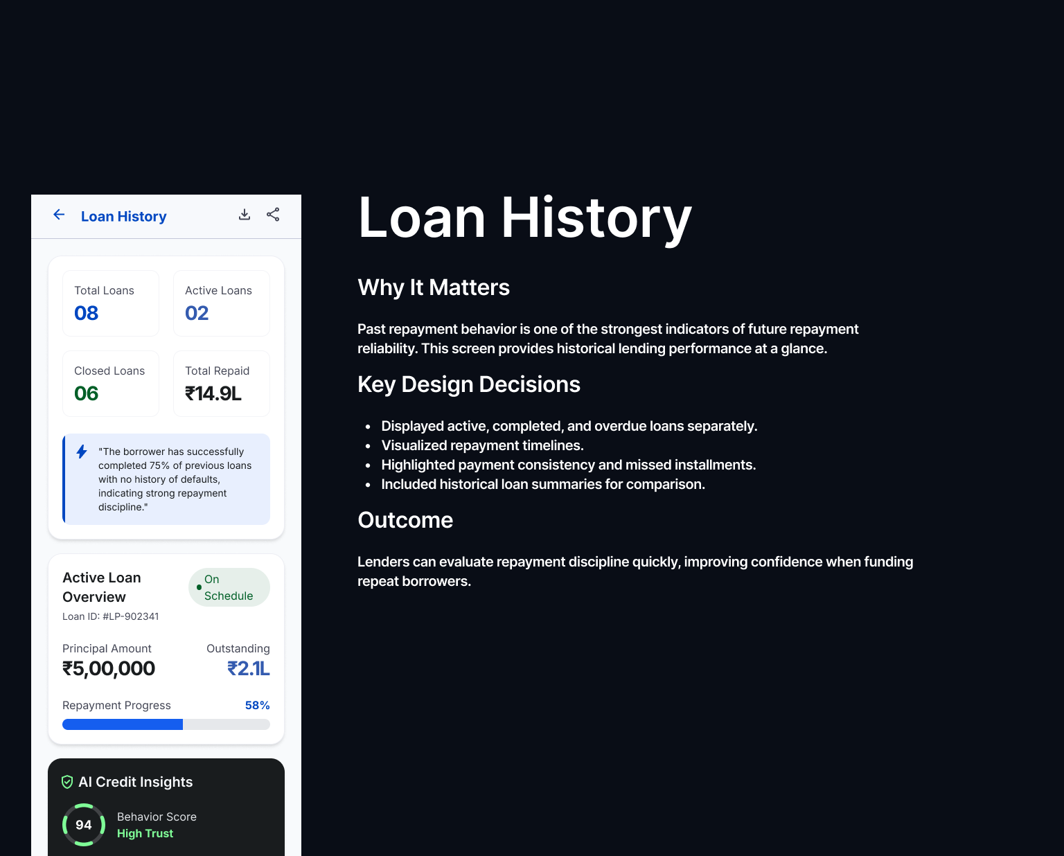
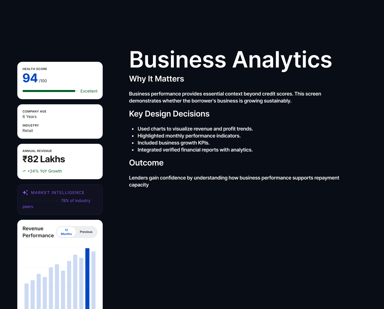
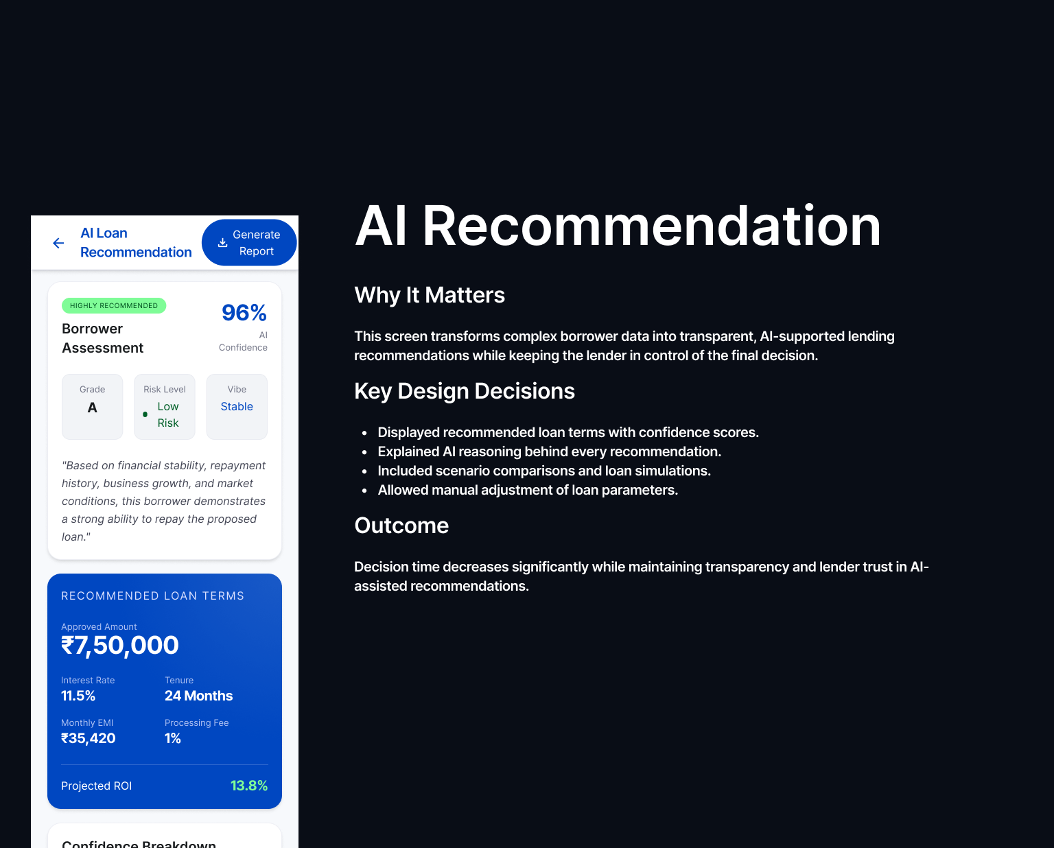
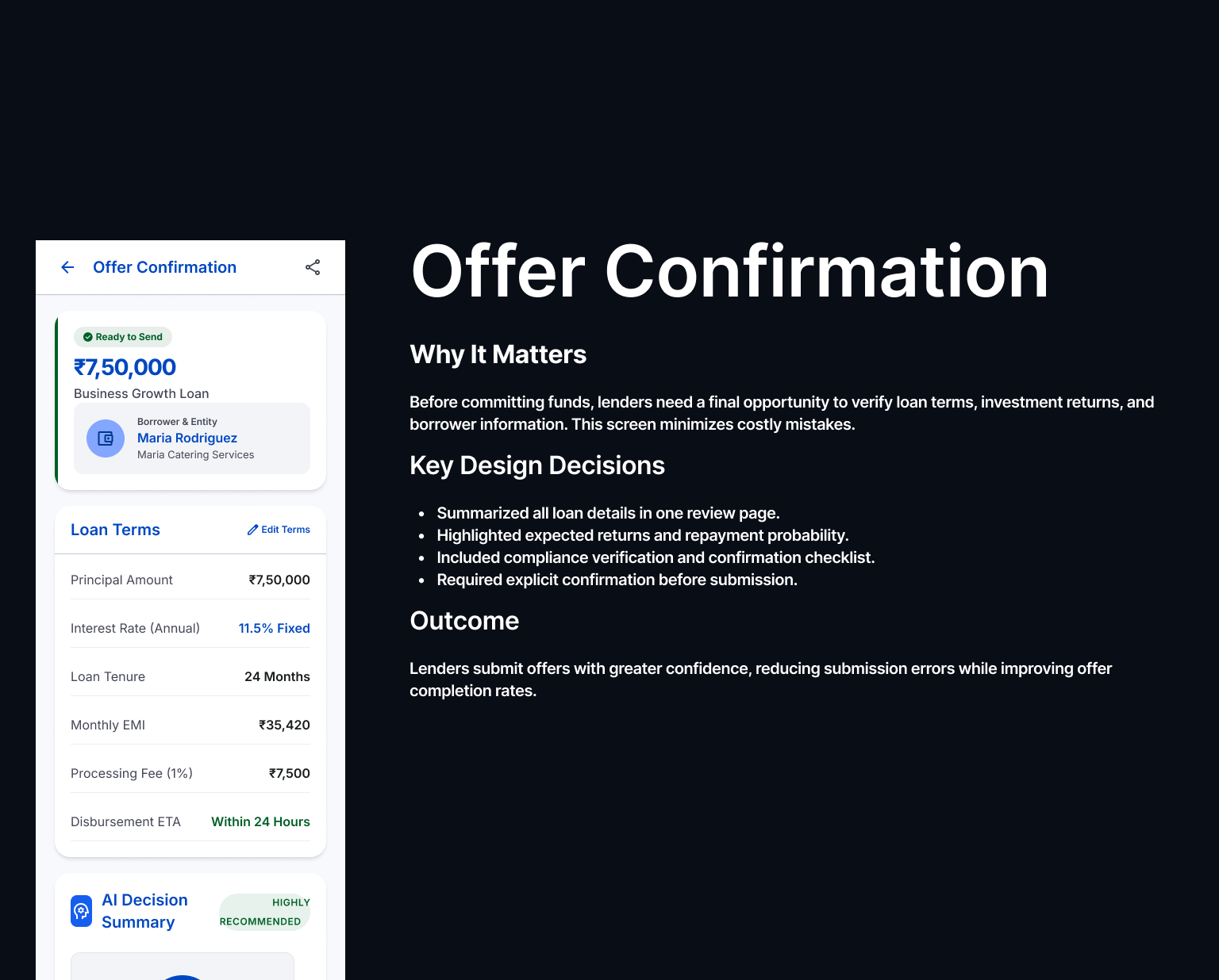
Legible risk, human borrowers
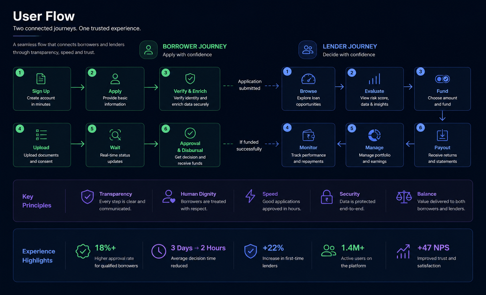
We designed parallel experiences that addressed the distinct needs of lenders and borrowers without compromising either. Lenders received clear, actionable risk signals to make confident funding decisions, while borrowers experienced a transparent, respectful application process that preserved dignity and accelerated approvals.
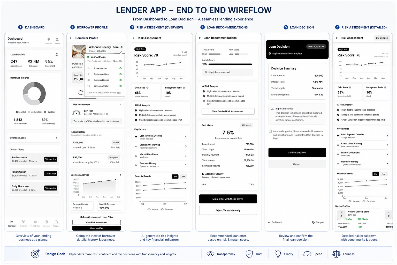
Clear Risk Signals
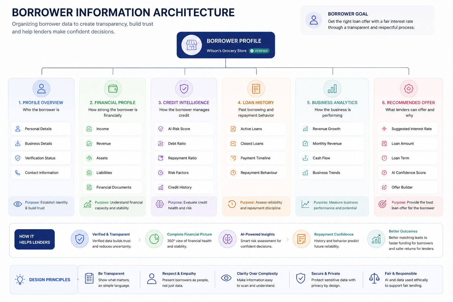
Credit score, income verification, and repayment history presented for informed lending decisions.
Confident Decisions
Prioritized insights enabled lenders to evaluate and fund qualified applications quickly.
Human-Centered Experience
Loan purpose and personal context provided alongside financial data, ensuring borrowers were treated as people, not just risk profiles.
Faster Approvals
A simplified application and transparent review process reduced wait times from weeks to hours for eligible applicants.
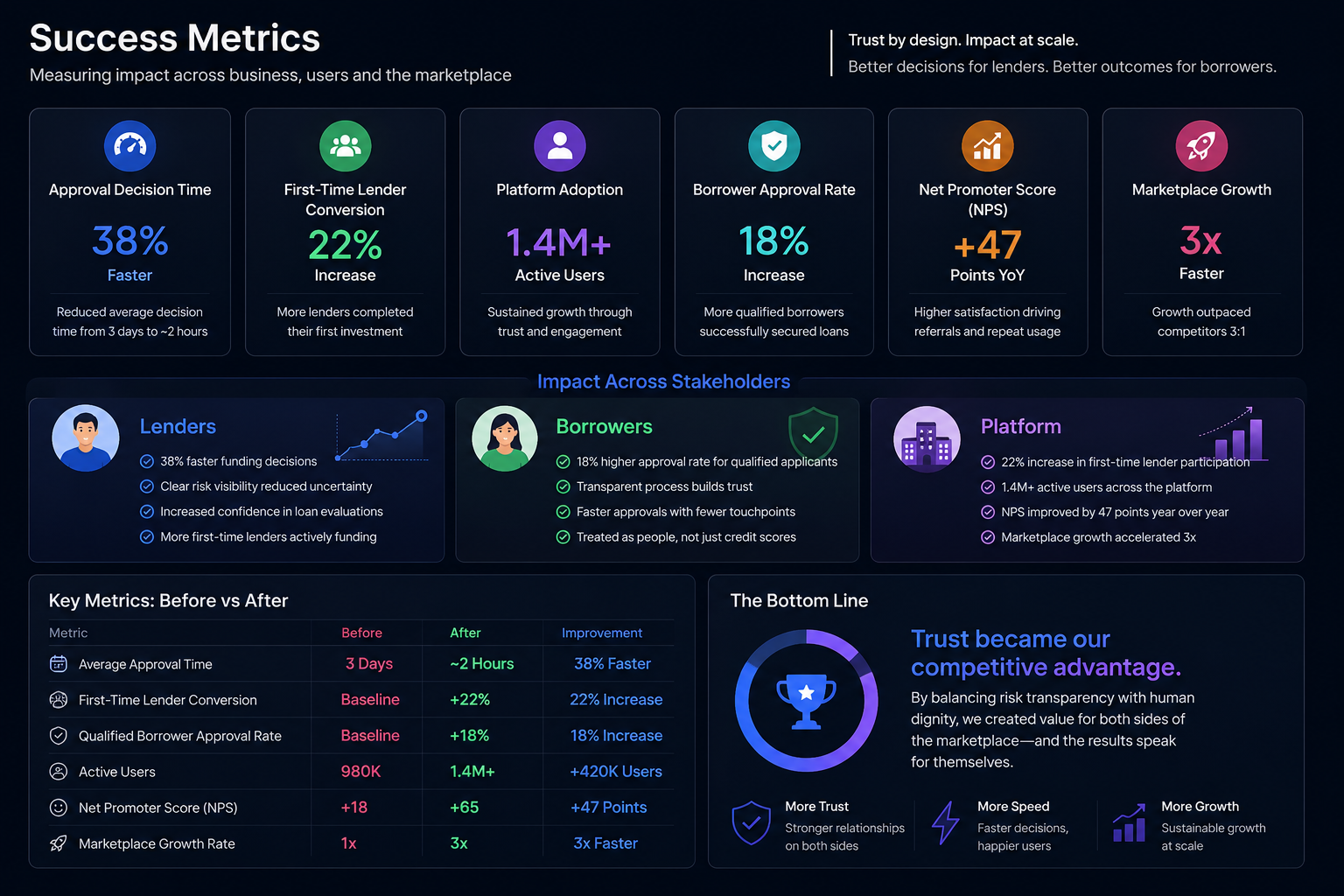
More trust, faster decisions
- 38% faster approval decisions.
- 22% more lenders funding a first loan.
- Platform scaled to 1.4M+ users.
The leadership lesson
On a two-sided product, design leadership means refusing to pick a favorite side. The job is to hold both needs in tension and find the design that serves both — and to keep the team from quietly optimizing for whichever side shouts loudest.
Executive Summary
Challenge
The lending marketplace struggled to balance the needs of two very different users. Lenders lacked clear, trustworthy risk signals to make confident funding decisions, while borrowers experienced an opaque process that made them feel judged by a credit score rather than understood as individuals. The platform needed to increase trust without sacrificing financial rigor.
Solution
Designed a dual-sided experience that served both audiences. Lenders received transparent, actionable risk insights to evaluate loans with confidence, while borrowers were guided through a clear, respectful application journey that explained decisions and preserved their dignity. The result was a marketplace that balanced transparency, speed, and trust.
Outcome
- 38% faster loan approval decisions
- 22% increase in first-time lender participation
- 1.4M+ active users on the platform
- 3× faster platform growth driven by increased trust and higher marketplace engagement

Success Metrics
Stakeholder Map
Research Plan
Objective: Understand the information lenders need to evaluate loan opportunities confidently.
- Identify the most influential risk signals
- Understand funding decision criteria
- Discover trust-building factors
- Uncover decision-making pain points
Objective: Explore the application experience and identify barriers that reduce trust and completion.
- Understand concerns about fairness and transparency
- Identify friction throughout the application journey
- Discover factors that build confidence
- Evaluate communication and decision clarity
Objective: Validate how risk data can be communicated without overwhelming or alienating users.
- Assess which risk indicators matter most
- Evaluate transparency of risk explanations
- Balance predictive accuracy with usability
- Align business risk with user understanding
Objective: Validate the end-to-end experience with both lenders and borrowers.
- Test task completion and efficiency
- Measure decision confidence
- Evaluate comprehension of risk information
- Identify usability issues and opportunities for improvement
Research Insights
Persona
User Empathy Map
Jobs to Be Done
Opportunity Map
Workflow Architecture
User Flow
Information Architecture
Concept Exploration
Wireframes
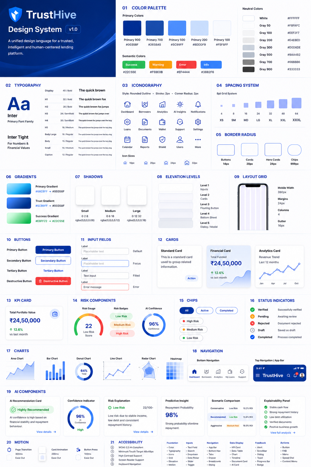
Design System
Final Design